If you want to subscribe to this blog on Blogger, simply use the add button on the reading list, then put the URL http://www.doodledemmy.co.uk/home/blog/ into the URL field.
Voila! My Wordpress updates will appear in your Blogger feed.
So I keep forgetting that I have this blog, as I've moved it over to my website www.doodledemmy.co.uk .
Just in case there's anyone waiting on this feed wondering why it's been so barren lately.
I'll probably stop using this blog altogether from now on. It's been nice.
I've been experimenting with as lovely new site called p3D , who let you upload .obj files and have them viewable in-browser. It's pretty cool.
I've experimented with low-poly models so far to test it out, but from what I've seen it can handle fairly high-poly meshes, though I suppose that depends on the computer the model is being viewed on.
The first guinea pig was my low-poly, low-texture shield. Works smoothly enough.
The second, and much more recent attempt was a voxel interpretation of a Platehead, an alien grazer.
The 'wow' image for Fentil: Another Life shows 5 Plateheads grazing on Tile Tops, feeding through their tails.
For this voxel Platehead I used a similar process to my voxel shark:
Begin with a profile of voxels
Add layers and 'chisel' voxels untila shape is achieved
Flip the voxel model
Add texture. Complete.
In other news, I've been working a lot more on DoodleDemmy.co.uk lately, and now it is complete with a gallery, xenobiology, and modelling section. Give it a look please. I'm also slowly moving my blog over to it, too, so posts may get thinner on this feed.
So recent rumours about Dead Space 3 have hit the internet. Ranging from being set on an icy planet, to featuring customisable weapons, story mode co-op and even a cover system.
Obviously such a strong departure from Dead Space's dark, claustrophobic setting and gameplay not suited to combat caused a bit of a stir among fans. Me being one of them, I too was taken back by this potential shift. This wasn't unexpected news, as Dead Space 2 was more action-oriented than its predecessor, and it only makes sense for developers to aim games to a more general, action-loving audience. The Resident Evil series has been going down this path for years, including the upcoming Resident Evil 6, which has been made even more action-y than any other RE title. Why? Money of course. To big developers, it no longer seems financially viable to produce a Survival Horror game in its true sense. Resident Evil 5 sold more copies than Resident Evil 4, so clearly Capcom were doing something 'right'.
No, Capcom, you're right. There's nothing more terrifying than well-lit open spaces
However, we don't know that Dead Space 3 will take Resident Evil's path and become a full-on action cover-based shooter, this is based entirely on a loose rumour. The co-op seems like a horrible idea, though, as adding another player or brick-stupid mandatory AI will only detract from the isolated feeling of Dead Space - and horror in general. A cover system may not be such a bad thing for a horror game, however.
A critical element of horror is suspense - which in turn is a result of the relationship between two factors - Hope and uncertainty. The player hopes to reach their goal, be it reaching the end of a level, escaping a room or simply surviving. The uncertainty arises from the ambiguity of the player's ability to reach this goal.
Now, suspense is relevant to any genre, and even games such as Super Monkey Ball can create suspense using these factors.
Recently I have been playing a lot of Deus Ex: Human Revolution, a brilliant game that is brilliant. The game discourages the brute force approach, encouraging players to sneak their way around. These are tense moments - hiding in an enemy stronghold, hoping that a passing sentry won't bother to look over the small piece of wall you're pinned desperately behind, alerting the entire building to little ol' you. These stealth moments are some of the tensest parts of any game I've played. This example, of course, only works when the player is vulnerable - when there is some risk associated with being discovered, be it Adam Jensen is understocked in weaponry, low on health or simply trying to get that ghost achievement. There is a tangible suspense and this isn't a game designed to scare. This needs to be put to horror use.
Tension. Also, robot arms
Amnesia: The Dark Descent, i.e. one of the scariest things ever made by human beings, lets the defenseless protagonist, Daniel (this scared me a little when the game seemed to be talking to me directly) can either run or hide. Hide around corners, hide behind doors and hide in cupboards. The game even gives the player the ability to peek around corners without coming out of cover. All this to avoid some guys with weird faces.
Pictured: World's most effective laxative
Now, I have had plans for a cover-based horror game for a couple of months now,'in the works', so to speak, so this is an idea that I've had to pitch to people. In this game, the protagonist runs and hides from his problems instead of facing them - it's in his character. With no means of combat or defence, he is pretty much done for once his cover is blown. Blown cover in Metal Gear Solid and Deus Ex generally results in a clumsy panicked attempt at a firefight, raising the tension from moderate to somewhere ridiculous. My horror game has an enemy monster which can follow the blood trail of the wounded protagonist right to where he is hiding. When this pig/dog/moth finds the player, it alerts all surrounding enemies to your presence.
So from this we could believe that cover in Dead Space 3 could be used to great effect. Encouraging the player to keep Isaac hidden from the necromorphs and new human enemies would be a great way to create atmosphere. Combining this with the gore and panic from the previous 2 titles, players could be given a truly horrifying experience.
---
On the topic of video games currently being designed, I'm also adding more details to Machina, a '3rd Person Puzzle Platformer thing with birds and Moais' video game idea I've had for quite a while. It occured to me recently that I haven't put much, if anything online about Machina, except for a few halo concepts. Over the next few months I'll be putting together a brief production bible for it, including characters, creatures, settings, designs and a basic story and themes.
It has occured to me while designing things for the two games is that most people may be rushing in with the visual, sound and kinesthetic models - i.e. the game - and leaving the story, themes and emotions to lag behind. People want to make games, not tell stories.
If any of these projects sprouts wings and takes off, I'll be sure to employ an actual writer to make sure that a good story with good wrtiting is told, and doesn't play out like a 5-year-old scribbled it down.
In some spare time, I've been working on a model of a creature from one of my dreams about a year ago.
The scavenging Skewer:
"Me and some others were looking into a large mountain lake on a blue rock dam. The sky was a soft lilac and the rocks of the mountains were a greyish blue.
We looked over the rail into the dam lake to see a manatee with ribbony extensions that rippled with the water as it swam towards us. It stopped at the wall of the dam and looked up at us through the water, rolling playfully.
I say to the person next to me that it's a manatee. They disagree because "it doesn't have hoof caps, so it can't be a manatee".
There was a dark shape appearing below the manatee in the water. As the mass got closer, the 'manatee' sensed its presence and swam off. And not a moment too soon. From the deep indigo water erupted an enormous, shaggy beast. When the water had settled from the air, the beast was showed to be a massive brown bear holding an equally scaled fish-like creature, about ten stories tall from the water, and that was just from the waist. It gave a deafening roar, took a bite from the already butchered fish-thing and discarded it. It landed with a fleshy thud on the dam.
I would have inspected the corpse, with its fleshy exterior and protruding bones, but the bear seemed angry and took swipes at the now gathering crowd.
High in the air a burning whirring sound got closer. Two 'skewers' were flying up overhead.
They had leathery black skin, striated down the body for aerodynamics. Near the back were two angled bony struts, one on each side of the body, and each with a large organic jet engine at the end, each with small fleshy fins to assist stability and giving out a burning roar as the power the creature's flight. A smaller engine whirred below them further down the struts, taking the total engine pod number to 4. Halfway along the body are the creature's eyes. Grey/brown/green irises and constantly looking around independently, they are set upon 2 flat skull panels that project rigidly from the main body. The eyes are set facing upwards. Below the skull on the bottom side of the body is a micro-serrated feeding blade, with lots of liquid-absorbing holes.
Terminating the strong, flexible neck the front of the creature is the sonar head/intake grill. The skin of this organ is a shiny, leathery texture, with the front end of it a jaundiced yellow and fading to the black of the rest of the body at the tip of the neck. The sonar was just audible, and was a constant, grating sound. Sort of like the sound of unzipping a zip, increasing the frequency and putting it through overdrive filter.
One skewer turned its sonar head towards the corpse, briefly inspecting with its sonar (and possibly smelling the carrion with the intake grill) and banked down and descended. The other followed. By the time they approached the giant fish carcass, most of the crowd had cleared. Only when they slowed and landed gently on the corpse, was their true size visible. They were about the length of a train carriage. At the sight of these creatures, the bear gurgled and retreated back into the water.
Once on the corpse, they both shuffled to work their feeding blade into the flesh. Despite their enormous size, they both only just covered the fish body."
The dream - 24th June 2010 Here is doodles and description of the rest of the dream.
Here's my progress so far:
The orthographic diagram
The 'barrel' technique I adopted from a video about a chicken.
This basic planar UV projection worked okay, but I'm in the progress of smoothing the mesh and unrwapping it properly. I've had a tinker with RoadKill, an auto-unwrap tool, but I've had no luck with it yet. Once it's unwrapped I'll bring it into mudbox for detailed sculting and painting.
So the USG-Ishimura (my new fancy computer) has been allocated rendering duty.
However, while the computer is pretty beasty for everything else, rendering seems to be what the mining vessel seems to struggle with.
I guess planet cracking is more its thing
It's taking the my computer 25-30 minutes to render each frame, and despite tweaks to protocols, added scripts to clean up texture referencing and scene clean-up it still struggles. After rendering on and off for a few days, though, the shot is finally rendered.
Almost. The remaining few frames are being delegated to other people because their computers seem to do a better job.
So, in somewhat related news, I recently bought Dead Space 1 and 2 on Steam (because they were cheap) and I finally came across myself.
And subsequently came across myself. Sorry.
In between working on projects, I've been working on my website. This is the design/layout I'm thinking of using for my home page.
The hazard lines seem to be a running theme, which I quite like.
I added a monster me to the background.
I need to update the 'under construction'page I have for my website at the moment, as I imagine that blank page will put people off. So that'll be the plan for today. I'm trying not to make the design for the website too busy.
I gave up on the Photoshop filters for LoveHate, so instead I went back through and re-drew each frame.
It takes a while, but it fits with Alice's sketchy style she's using for the film.
The lines are all scribblified, now I just need to go through and colour it, which won't take long because it is in Flash and Flash is lovely with colouring (K -> click). None of that manual drawing as seen in ToonBoom and TVP.
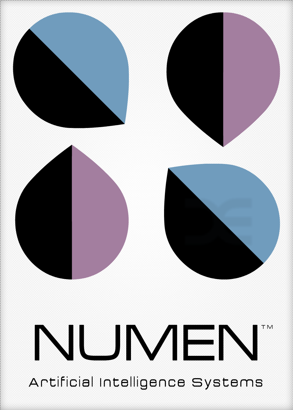
Now finally, before I get back to work, I have been setting myself a challenge. Dictionary.com have a Word of the Day app, which brings you a new and fancy word each day to help expand your vocabulary. This in conjunction with my recent efforts to get better at logo design resulted in the 'Logo of the Day' challenge. Inventive, I know. The challenge involves thinking of a company/brand/product with the word of the day name, and then see how that would affect the logo design and what message it should convey. Hopefully it will force me to try new styles and techniques.
The first day was May 3rd, Numen: "Divine power, especially one who inhabits a particular object."
This made me think of powerful AI systems residing inside a machine built body - an almost ethereal concept like consciousnesses contained within a mortally-constructed object strikes me as very similar to the genie in the lamp.
The drops line up to form an N, but what I didn't realise (and I was pretty pleased with this) is that you can use the N lines to make the letters A I . I'm just so smart even I can't keep up.
I've already failed the 'daily' aspect simply because I don't have the time to make them all neat like this one, but I have done designs for the latest 3 which I will upload eventually.
Now, you may watch some things.
Gundarr: A-Shuckin' and A-Hivin'
"Stop laughing at Gundarr!"
So Kernel's animation is all done.
This is quite a major milestone.
That's not entirely true, there are still some tweaks to be done to certain shots and I'm still adding the beautiful details in Kernel's final shot, such as floating debris, flapping fabric and organic growth. I'm actually pretty proud of the shot's animation, so I can only wait to see it rendered once it's finished.
I'm also going to be playing a part in Kernel's sound design now that my place as Animation Director is no longer needed. This will include not only foley but the grunts and groans of Leonard himself. That's right. I will BE Leonard.
Pictured: Me.
Now that my animation 'talents' are no longer needed on Kernel, I'm helping other projects with their animation as well.
One of these is Alice's Love Hate, which is VoxPop short film, similar in principle to Aardman's Creature Comforts, only in 2D.
This bit is of an interview with a young boy who hates everything. I drew these lines in flash, but after animating I was told that they are too clean, and didn't fit Love Hate's more sketchy cut-out look. In an attempt to save time, I tried Photoshop's batch process action to apply a filter to the whole image sequence.
These are the most qualifying filters
The batch process is actually pretty useful, and I also discovered how Actions work, and seems like a great way to give multiple images the same 'feel' with ease. I'll definitely be trying it out in the future.
Here are the 'Splatter' and 'Cutout' filters applied to the animation:
Turn it up to 1080 HD and fullscreen, please.
The 'cutout' filter makes it look like the frames have been drawn with a heavy ink pen, wheres the 'splatter' filter makes it looks like it's crawling with spiders.
I feel that the filters will end up not working, and I'll have to just draw over the original lines which won't be difficult, but I will definitely be tedious. This is what interns are for.
In conjunction with our 'professional practice', I have been working on marketing and self promotion.
I've already got a basic website up and running, but lately I've been working on two other approaches. One is a basic idea for my business card:
'front'
'back'
I decided to not have a definite front or back to the design (hence the 'quotation marks') because to me it just makes sense to have information on both sides. Why would you have information squished up in tiny font on only one side and leave the other blank? The basic design philosophy for these is that I create very graphic designs such as logos and layouts, but inside the white space there is also the weird organic stuff I doodle and draw. It gets my point across before they've even read anything. I'm still refining it, and I don't want to go for this first design because that feels too easy .
The other piece of advertising is printed Tshirts:
This is a test I ordered from CafePress. It cost £20, which isn't too bad seeing as that includes shipping and it's a good quality T-shirt, not some paper thin transparent sliver of cotton. It's a print of this drawing:
Considering I didn't change anything to make printing easier, such as adding halftone-dots for shadows or playing with contrast, the design came out perfectly. Much better than I expected. I also have my logo and website address on the back collar (so people know where to find other things like this).
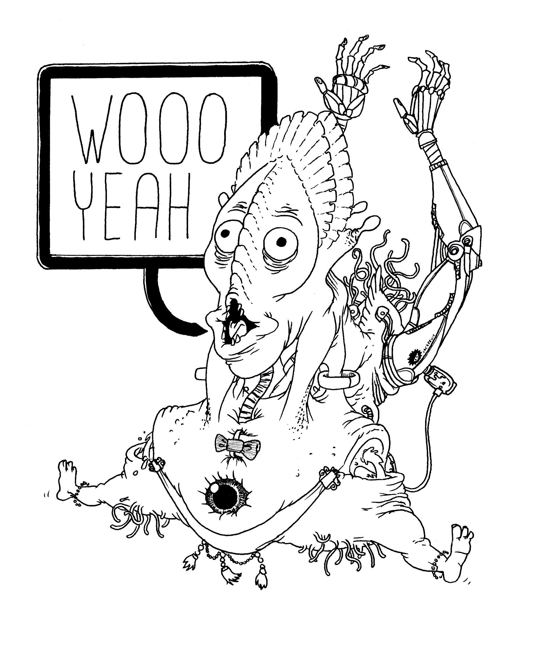
I have a similar drawing on the way, and I'm definitely considering making it into a T-shirt. This one:
There won't be any watermarks on the final design, plus the colouring isn't finished.
Woo Yeah is going to be coloured and shaded with halftone dots and other things that work better with screen printing. The best advice is to avoid gradients, which can make the shadows look a bit blurry and add colour noise where the colour should be completely flat. For some reason the halftone dot filter in Photoshop uses a gradient as opposed to smaller dots, which I need to figure out how to fix.
Finally I am doing some animation for Insa Burch's 1890, a documentary about the plight of Female skaters. The film features live-action footage with composited animation integrated into the scenes.
These are just stand-ins for position and scale. The final designs will be closer to Insa's hand-drawn, almost woodcut drawing style.
I'm only doing this one shot for the moment, as I'm still unsure of my availability and I don't want to promise work I can't do.
After working non-stop on a big block of animation for Kernel, I decided to take the weekend working on other projects, ready for Kernel first thing on Monday.
This film is looking goooooood
One under-attended project is Jackson Tayler's projection system, HexMap .
I decided to make a couple of loops for the project, all of which with a running thing of cubes/voxels due to the nature of the system.
These loops are inspired by three main sources:
Voxatron
This is a fun Indie game made by developers Lexaloffle
Voxatron is a simple twin-stick-style shooter rendered in beautiful voxels. The environments are even destructible, crumbling into voxel rubble if the player removes their foundations. One of my favourite things about Voxatron is that if an enemy or object clips off the lower edge of the screen, their fully fleshed out interior is visible. I feel like this mechanic could have been exploited more thoroughly, because it's not a mechanic the most games can pull off with their silly polygons.
3D DOT GAME HEROES
A game that re-imagines old-school RPG's in both visual style, gameplay and difficulty. The entire game is made of voxels, and has some lovely lighting effects.
And finally there's Pixels by Patrick Jean.
This beautiful piece of post-production speaks for itself. Just watch it if you haven't already. I love the glassy/waxy effect on the pixels, and how the Earth becomes a lower and lower resolution block.
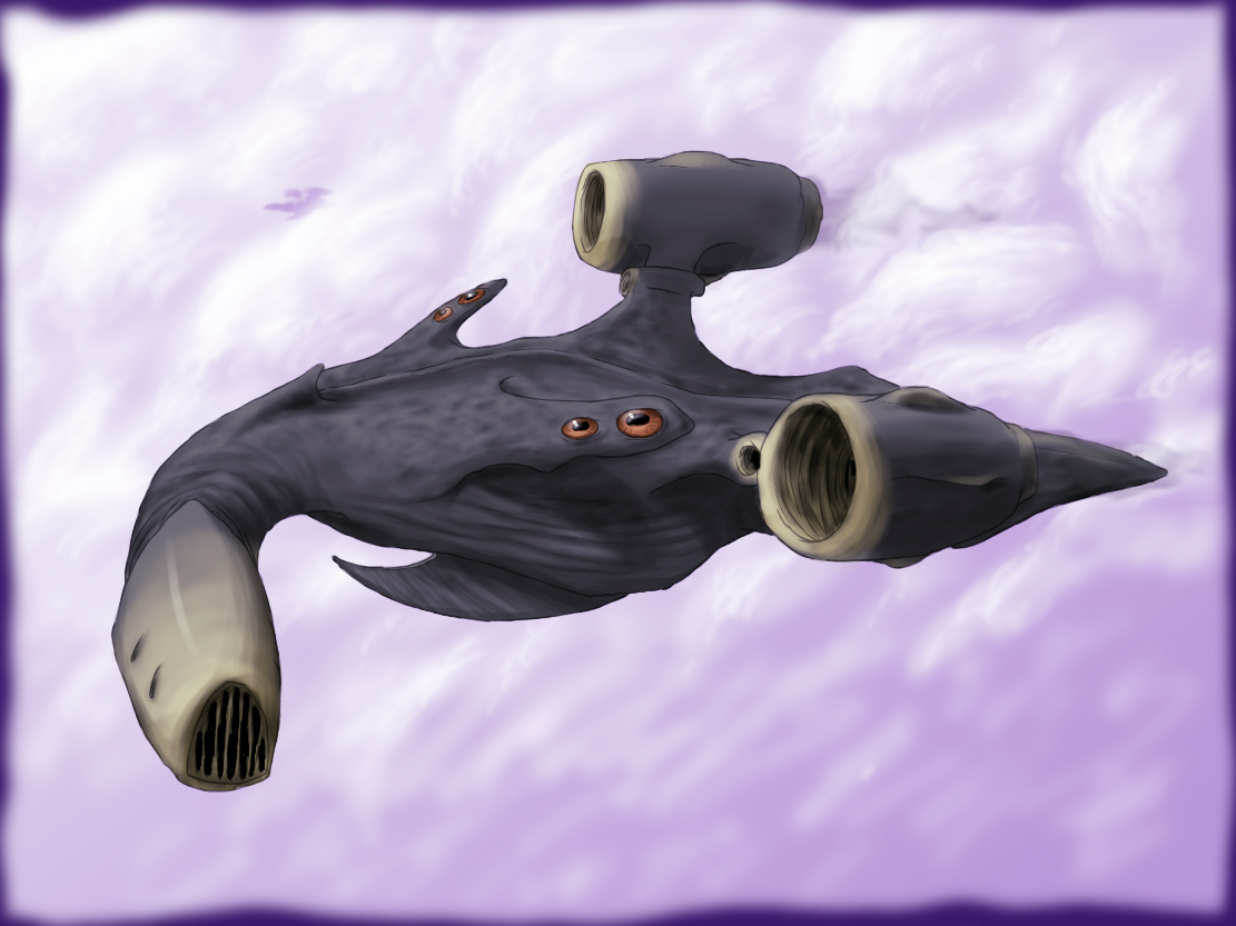
Now back to Hexmap. The first Loop I managed to finish was a swimming Voxel Shark.
Here's the work in progress:
After finding some reference, I made the shark's profile.
I originally intended to do an exploded diagram of all of the shark's voxelly innards. I abandoned the idea soon after realizing how long it would take. I may consider it once I finish some sort of shark loop.
And here is the finished product - All rendered to perfection.
And here it is swimming. hand animated voxel by voxel.
This shark came out much much MUCH better than I was expecting. I'm genuinely impressed and surprised with how it looks. Hooray for me.
I heard however, that voxelising software can be buggy. I haven't had the chance to give the software a go, so it could potentially be brilliant. I like doing it by hand, though, it feels more 'crafted'.
I am still yet to immerse the shark in a HexMap template due to some issues with Maya crashing when saving - but I plan on making the shark move around the Z-X axis to make the swimming a bit more animated. Also adding some bubbles moving through the water would make the shark look like it's travelling. Also, potentially, a sea floor with an animated pixel texture to synthesize the appearance of movement. That will be a mission for either what remains of the evening or tomorrow morning.
Another loop I produced is a beating cube heart.
I initially began a few months ago with these tests (and their nauseating moving lights):
But I had forgotten about them whilst working on Kernel. This weekend, however, I re-rendered the heart and made it HD, brighter and more intense:
Focusing mostly on animation means that I very rarely render anything, so these two short loops provided some challenges and learning experiences (I still have to look up how to render an ambient occlusion pass). Also playing around with the colour correction in After Effects led tho this other render of the heart:
I quite like it, but I don't think it'll be as popular as the red heart. I've never really played around with post-processing because back in my youth animating in Flash, I'd do all of the colours in Flash itself (making uploading to sites like Newgrounds much easier) so tinkering with effects like bloom and motion blur in post doesn't really occur to me.
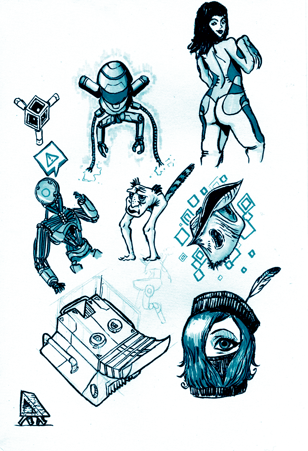
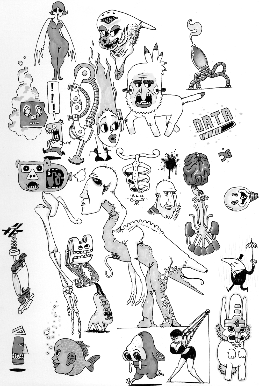
I've been doing a lot more pen/biro/marker work lately (mostly to fill the time made by play-blasting animation) but I'm getting more confident with blending and shading with them. Take a look:
Once piece of feedback described the Henbeck Medical company's logo as 'too busy'. I can see where they're coming from, but the aim of the logo was to convey careful intricacy, and the black 'pixels' overlaying the white heart is meant to reflect the company's devotion and development of prosthetics and artificial implants. One of which being AG NODES, which I will discuss in a later blog post.
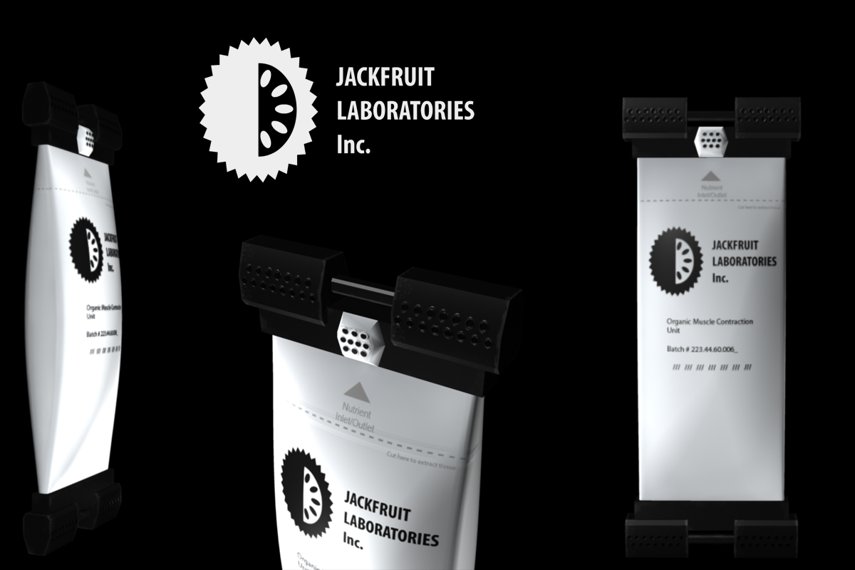
Another flight of fancy is this fictional method of providing artificial meat and muscle for prosthetics, which I spent a weekend creating in Maya. Jackfruit Inc. Muscle Packet
To avoid the assaults and accusations of Animal Rights activists, several companies turned to other ways to provide meat.
Some tried producing non-meat alternatives, which while financially viable, never really caught on as the replacement meat. Others grew designer animals which lacked capacity for pain and produced large quantities of muscle. There is, however, issues with hormones contained within the meat.
Jackfruit inc, a biotech company, took the approach of stretching muscle tissue across two bars and using electrical pulses to cause it to contract. An extension of this technology resulted in small meat 'packets', which are fastened to an elasticated conveyor belt and take a matter of weeks to grow to an edible food source.
The company is also collaborating with prosthetics industries to provide natural muscle for basic artificial limbs and synthetic pets.
The company founder Whilton Jack - an eccentric man - uses these packets in his prosthetic leg, and was quoted as saying:
"Sometimes I like to take the pack from my prosthetic and use it for dinner. I like to eat my leg"
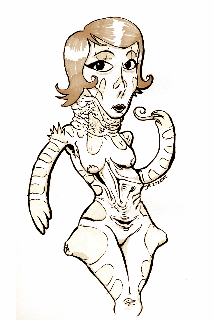
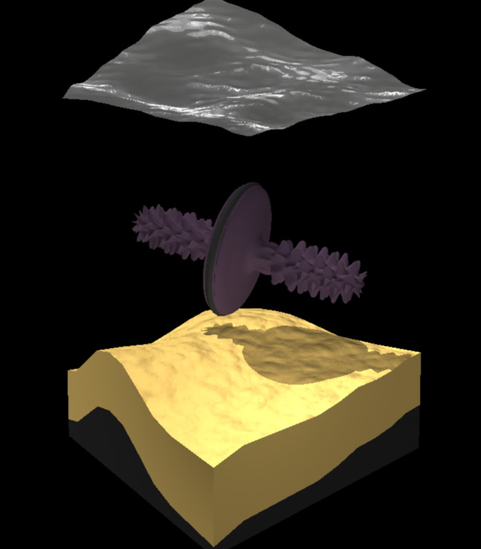
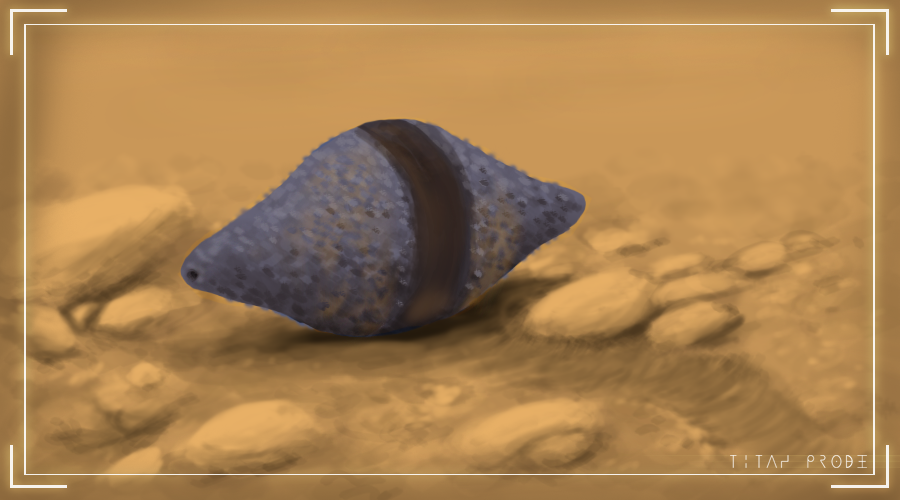
Another quick Maya experiment was to model some potential aliens for another speculative biology project alongside Fentil (remember that?) which explores the life that may be inhabiting Saturn's amber-veiled moon, Titan with its thick atmosphere and methane lakes.
So here is a Titan 'Fish'.
They swim through the water by spinning their bodies and modifying the shape, size and angle of the small paddles on their sides.
And finally I have a website up and running (sort of).
That's right, DoodleDemmy.co.uk is up and running. Even though it's just an HTML skeleton at the moment, I finally have a place to direct potential clients and anyone who is interested in my work, instead of having to direct them to YouTube and explain/apologise for my various internet aliases. Over the coming weeks I'll be improving the look of the site. Initially I was going to use Wordpress to build the site, but the famous '5 minute instillation' is a bit misleading, as it doesn't include getting database management software nonsense to simple install the Wordpress builder in the first place. So for now, HTML will do fine. I feel a little gutted that I no longer have Dreamweaver (I couldn't exchange it for a new OS copy when I got my new computer) so all my HTML and CSS is going to have to be re-learned. I'm still looking for a decent (free) replacement, but for the moment I'm using sites like www.w3schools.com to learn the basics once more. It has an HTML preview window used for individual lessons it teaches you, but it works with any HTML so you can just enter your website's code to see how it looks and tweak it as necessary.
Feel free to go to my website and click the links - I promise they'll be interesting.


.png)