Monday 27 February 2012

Designing a website.

It's becoming time to consider advertising myself, seeing as the course is nearly over and I'll need to get a job that I enjoy.
That, of course, is animating.

I won't be putting too much effort into that yet. I'll start in about 2 weeks when the Dissertation is handed in (scary). Until then, I have found websites with a look/features that look good and inspire me.

LittleBig Planet

What I like about this website (and the LittleBig Planet games) is the simple, graphic nature of the buttons in contrast to the busy, detailed background. The block colours make the site (and game) easy to navigate.


What I don't like, however, is how busy the website page is, and I'm not a fan of lots of bright colours. It is also in a blog-style layout, and would be no good for an online gallery.

Alex Reis

© Alex Reis 2012

Alex Reis is a digital painter of aliens and animals, and is a big source of inspiration. His website is a dedicated gallery of his art. The gallery itself has preview thumbnails along the left edge, and the background is flat black, which I guess is to avoid distractions from the paintings.
I like the opening splash image which acts as a link to the main gallery, although I was disappointed to find out that the image doesn't randomise.

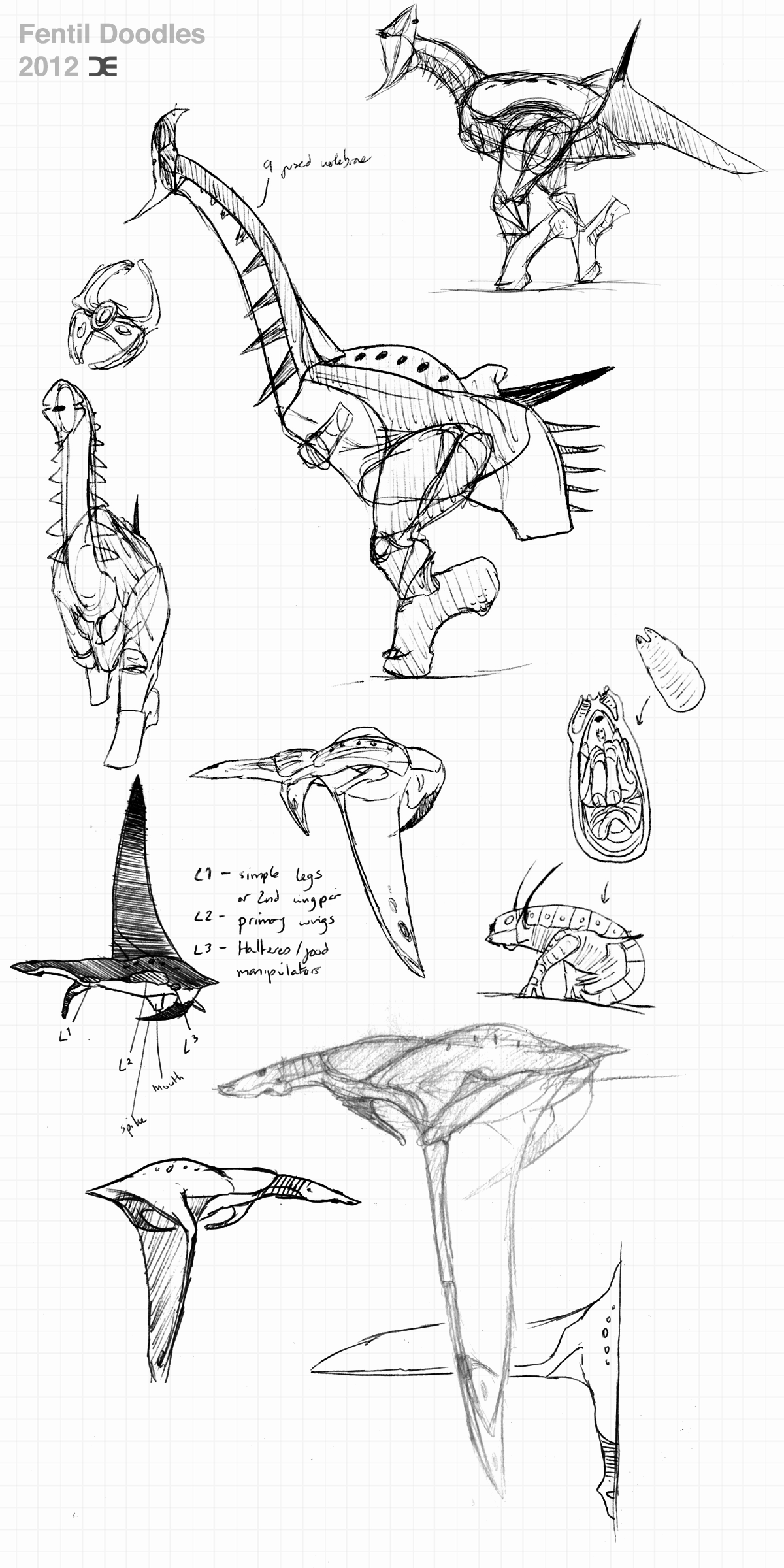
Other, non-internet, inspirations will include:
Deus Ex

What I like about Deus Ex's visual style is the simplicity of the interfaces. One can blur their vision to an incredible degree and still be able to navigate the interface. It feels as if this method of presentation is making a comeback now that the world is sick of overly shiny and busy buttons and menus from the late 90's. It also fits the graphic look I want for my website and includes the simple interface over a blurred, busy background. There is also the simple colour scheme. It gives the game an identity. I was thinking of blue for my website. Because I really like blue and black. It's kinda my thing.

Website, DONE!

While I won't be going for the shattered triangles, I do like the falling particles in the Deus Ex menu backgrounds. Seeing as HTML 5 is coming into popularity I figure I could try it out. Maybe falling squares or diamonds or something? I'd really like to have some extra level of interactivity on my website, and these things can't be too difficult to code, right?

This guy likes diamonds

One of my favourite internet toys is the Bio-Bak, an enormous web page with a fun little game built in. I discovered it years ago. It has lots of cool coded particles and sliding effects and whatnot.

I never said it made sense

I wouldn't make anything as extravagant as the Bio-Bak, but cool little toys like this must be pretty simple to create, but are surprisingly satisfying.
Satisfy me!

I wouldn't focus the website on these toys, and I don't want them to distract people from the actual content of the site, but I feel like a little bit of interactivity and 'wow' visual tricks could attract people to it.
Now that I've finally purchased a web domain, the pressure is on to design this thing and get it up and running.

Monday 20 February 2012

The masochism of late-night brain befrazzlement.

2:30 AM

After a few months of being good and going to bed at a half-decent time, I've started doing all-nighters again.
I know I shouldn't. Every time. I will always regret it in the morning after 3 hours sleep and the taste of stale coke and tea in my mouth.

So why do I do it?

As I work late into the night, listening to Deadmau5, Daft Punk and in tonight's case, this guy- time stops. The concept of the impending deadline vanishes. I have all the time in the universe to finish what I'm doing. Perhaps it simply reminds me of my younger days, spending hours and hours creating art and animation, regularly and willingly working until the early morning. Getting up in time for school didn't matter when I was crafting my one-man masterpieces.
Despite my love for this animation course, and all the people in it, I still sometimes wonder if I was more productive animation-wise before I came here, when animation was just a hobby and not a career choice.
Anyway.

Perhaps the enjoyment of these all-nighters is the feeling of accomplishment; that you've won the battle against biology to meet your goal. The relentless drive of the mind has won over the failings and protests of the body. And a battle it is. The best comparison I can think of is carrying a heavy sack of chicken feed on your back. You know, that thing people do all the time.
It's relatively easy to stay upright and carry it as long as you put the effort into balancing. If you don't put in the extra effort into balance, your strength lifting the sack is wasted and you come crashing down, spraying your chicken dinner all over the ground. What I'm trying to say here is that it's not the actual working that is the hard part for me, it's constantly keeping my stamina up to stay awake. One slip and boom I'm asleep. This to me is the closest thing I can describe as the 'extra gear'.

The fruits of this extra gear?
Well:
After making the 'Ice Cold' logo for Red Bar Radio, I felt inspired to make another piece of art for another favourite podcast, Distorted View.

Don't judge me by my choice of podcasts.

The basic idea was to have the show's host, Tim Henson, in a Pedobear outfit beckoning children in. His idea was to have the advertisement he described on school buses and posters, in response to a news story of Texas schools selling advertising space on the property.

On a subject of less ambiguous morals, I have compiled and combined the Fentil doodles and EVA doodles in my sketchbook from the last two months.

Hm, not as much as I'd expected.
I still have yet to combine the Machina and Weird doodles, but those will be for another post, soon.

Now back to this darned dissertation.

Sunday 19 February 2012

Yet another backlog

Sigh.

I really need to get into the habit of writing smaller posts more frequently.
This is going to be a long one.

First thing's first - Kernel

As semi-self appointed animation director, my job is to give Kernel it's animation style and direction. After consulting with Olly, the real director, we came upon the possibility of an almost stop-motion feel for the animation, especially after this first animated shot. With the amazing work that everyone has put into modeling, texturing, rigging and lighting, it certainly would be an interesting way to go.

Impressed?

The discussion also reminded me of how the Prawns were animated in District 9, with very little use of 'tweening' and lots of subtle keyframes. This apparently gives them a more organic look. See for yourself.

He also suggested films such as the Backwater Gospel:

How many times is this going to feature on my blog?

And Little Tombstone:

LITTLE TOMBSTONE - ESMA 2011 from Little Tombstone on Vimeo.

To use as inspiration.

I'll be compiling a little information package with this information and more for the future animators on this project in order to keep a consistent look throughout the film. I finally feel useful.

Now, H0le:

I haven't been working on H0le as much as I should be.
I have, however, finished the rough animation for that climbing shot:

This was my first real attempt at ToonBoom, and I feel that this slowed me right down. I've decided to do the rough animation in Flash. I am much more familiar with Flash and this rough animation can be exported as an image sequence that can then be imported into ToonBoom for the cleanup artists.

Now onto some personal business...

One of the regular podcasts that I listen to is Red Bar Radio. The host called out for fans to design a logo for a joke drink 'Mike's Ice Cold Diarrhea', which was to be put on t-shirts and other items. The 'brief' was simply to resemble old root beer labels.


Here's my attempt. Sadly I submitted the design a day too late and was not chosen, although I was given positive feedback by others of the Red Bar Radio community.
This is the first time I've ever worked on anything for t-shirts, and I had to learn a few things, such as having to use the half-tone dot effect for shadows. It was a fun experiment, even if I didn't get picked.

I've also been playing Zelda recently, and I noticed some cool effects.
The first from Skyward Sword is this cool diamond-shiny effect.


So I tried to emulate this effect thanks to ol' Leonard, here. It seemed to be simply the matter of plugging a rotated checker-board pattern into the eccentricity of the shader and boom!

Old Man Ghirahim.

In another attempt to copy something Zelda-y, I wanted to have a quick go at this effect in Twilight Princess:


here, the darkest areas and shadows are transparent, leaving only illuminated areas visible. This gives a lovely ghost effect, reminding me of the technique used for projecting ghosts on theater stages, known as "Pepper's Ghost".

The technique

The effect

So I had a little play around with Maya's nodes and did some connecting on the faithful Platehead model:


This one used the sampler.Info.node>Camera facing ratio (used to make simple rim lights)and connected it to the transparency.


Here I plugged Surface Luminance (duh) into transparency, which has a much better effect and is more physically resembling of the Pepper's ghost technique.


Some tweaking and different angles.

What I like about copying techniques used in Zelda games is that they're cheap. The Wii is a runt in terms of processing power, and so Nintendo can't afford to use fancy shaders for everything and have to find the effect another way.
I feel that it is always best to find the most economical solution, and being able to optimise your work can only be a good thing. Perhaps that's why I have so much love and respect for low poly games. It could just be nostalgia, but there seems to be a certain consciousness and deliberateness in the models. Every extra poly is expensive, and trying to keep to these limits turns it into a much more creative process. The same can be said for any other artistic medium.
Challenge fuels creativity, and without it, we'd still be a bunch of sponges and worms drifting in an ocean.

Finally, here's some drawings that I done do did:

Free Sword


Fi, from Skyward Sword talks a whole unskippable lot. She lives in your sword. That is the joke. Hilarious.

Breaching Octopus


This is from a dream I had a while ago. I was filming the giant swimming octopus in the background, when a pod of smaller octopus began swimming alongside my speedboat like dolphins.

Marker Madness


It's been a while since I've used my markers. It feels nice to shade stuff sometimes.

Now prepare for a WHOLE mess'a drawings!
In the next post. This one is already too long. Plus the drawings need cleaning up.

Be ready!

Loyal Followers