As of last post, I've finished my little speed-run theropod dinosaur Maya business. We left off with this:
A partially unwrapped mess of a creature.
So let the UV fun-wrapping begin.
I started with the main parts of the creature: The head and top/bottom halves of the body. The different colours show the separate UV bits. It just helps me see which faces I've already projected, so I don't accidently mess things up.
Such beautiful plumage
All of the parts have been separated out, but they still give the texture too much distortion, although you can't see here.
It's like a really old-timey jester
The super fun process of grabbing the UV points and dragging them into place. I cheated a bit and overlapped the legs and arms, which saves texture space. However, I made this theropod as economical as possible, so I tried to pretend I was making it for a crappy game.
Much better. All he needs now is a yellow corduroy tophat.
Then I added the texture.
Don't use alpha in your textures, kids. I causes all kinds of bizarre tomfoolery.
And FINISHED. Isn't it cute. derp
I'll probably rig it next. (Oh, and give it some teeth.)
I also did this quick sketch of a chunky Fentil vertebrate.
the Blogger photo uploader was being particularly irritating today.
Those little things around its feet are hoppers; larger cousins of skippers. They are fleeing to the safety of their nest within the tile-top lattice.
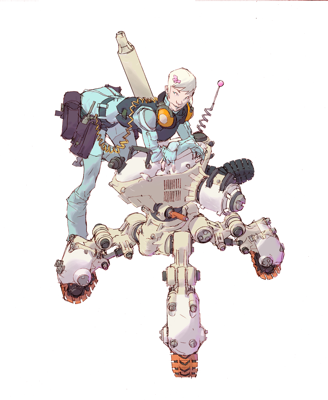
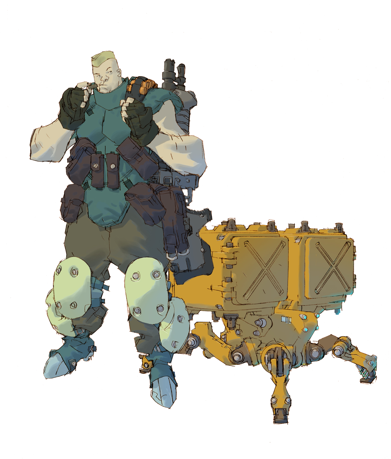
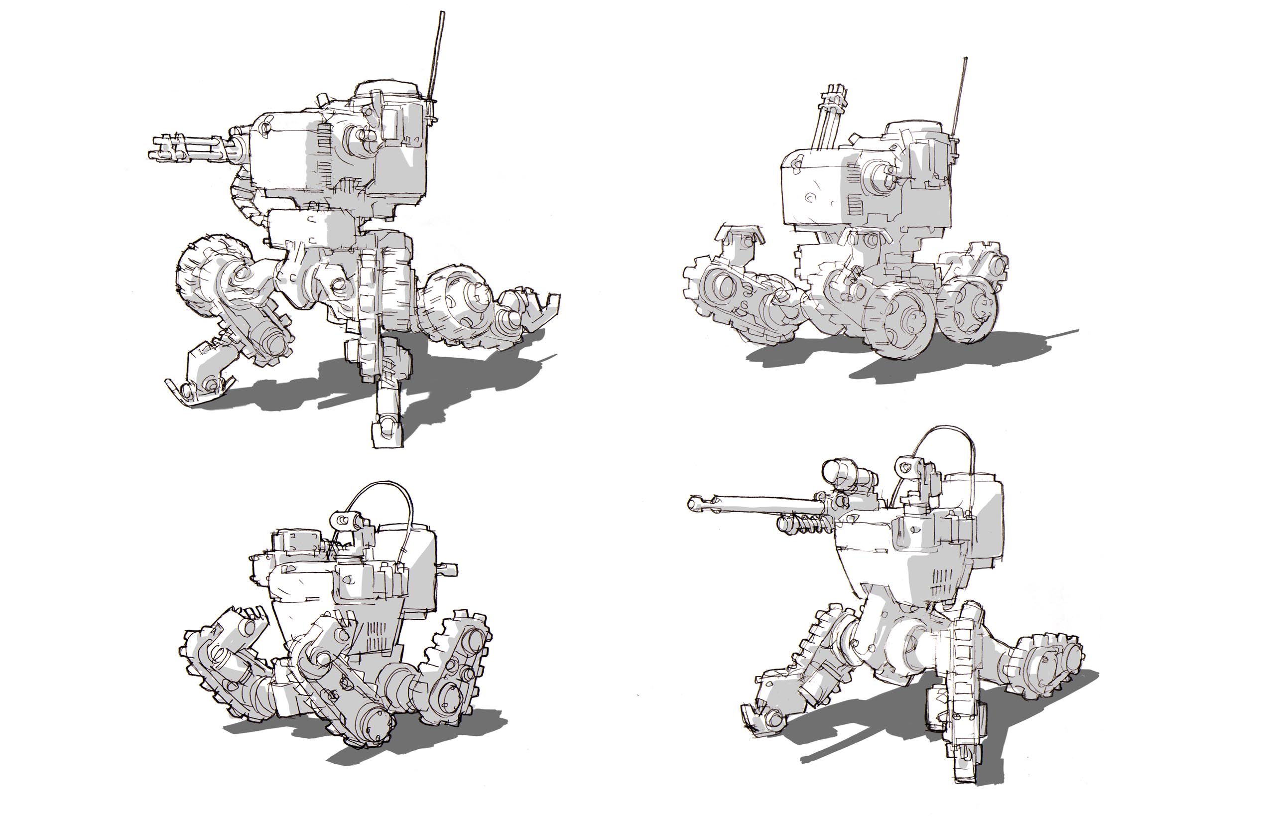
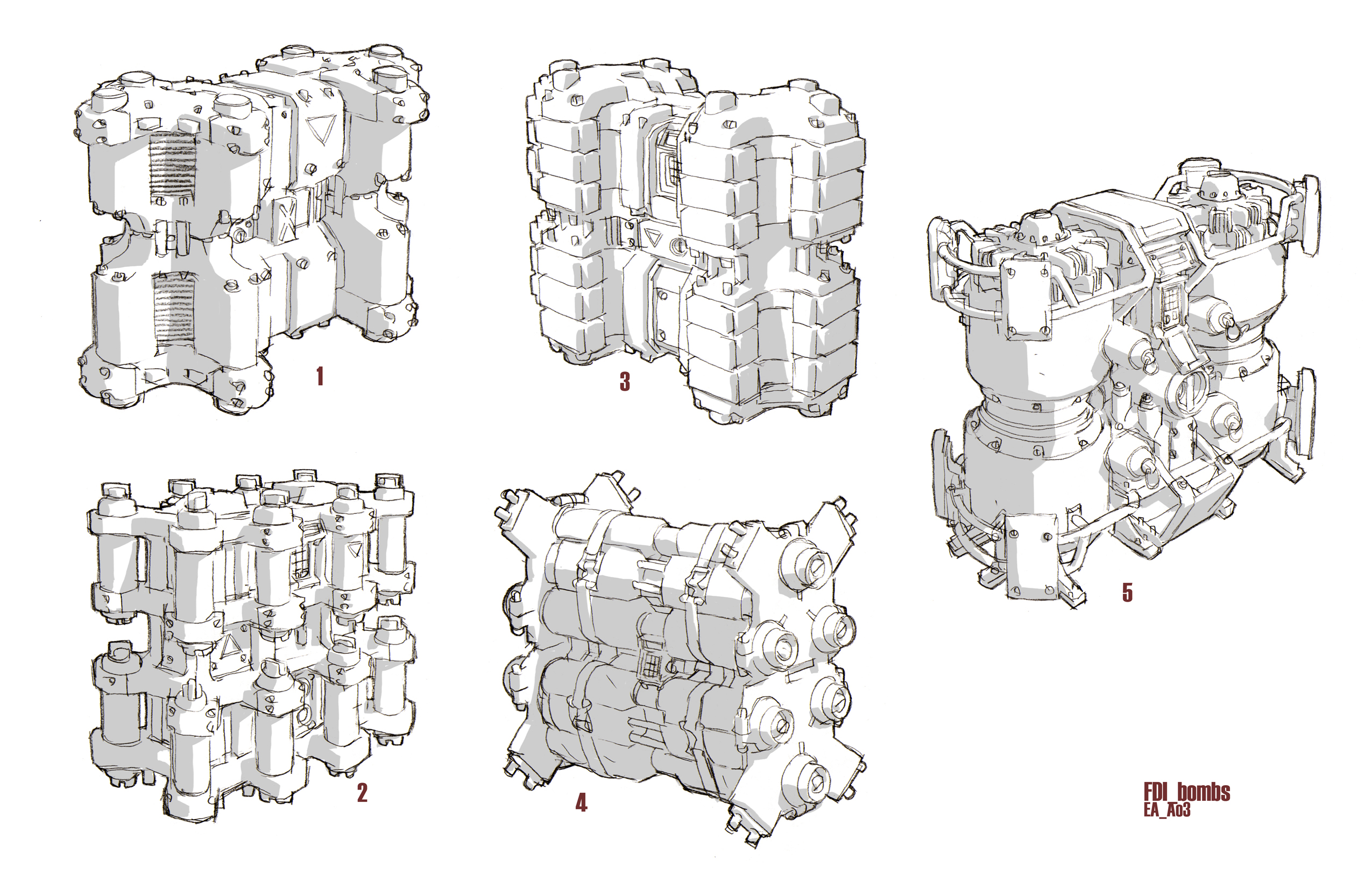
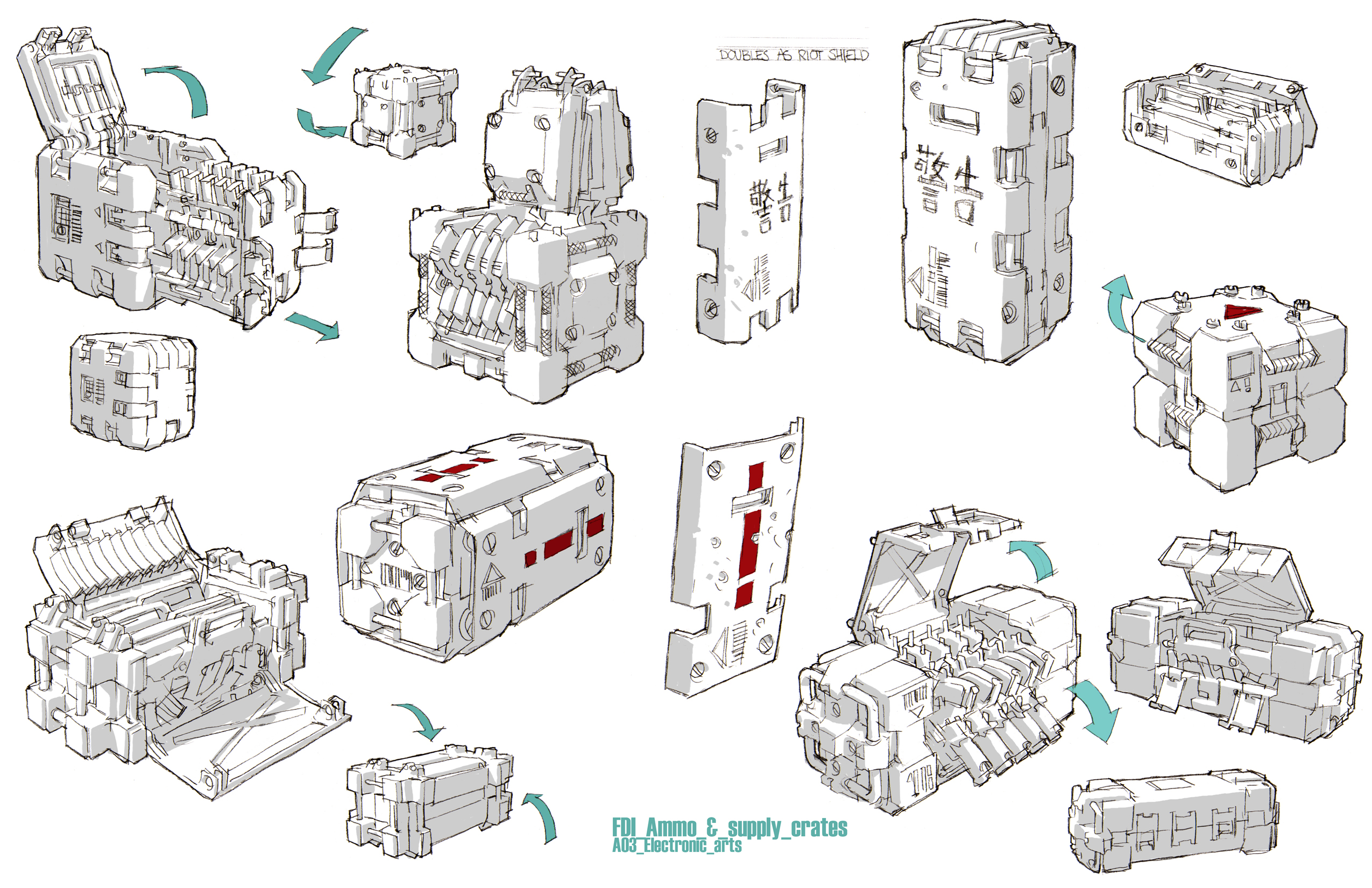
I also recently found This Guy on DeviantArt and I love the way he draws mechanical things.
I've been getting better at photoshop painting, and I'm really happy with the hard shadows cast from the blue, synthetic muscles, it adds a surprising amount to the picture. I wanted to keep the colours simple and bold.
I've also been tinkering with Fentil related photoshop business. I'm planning on colouring this in the same way as the guy above.
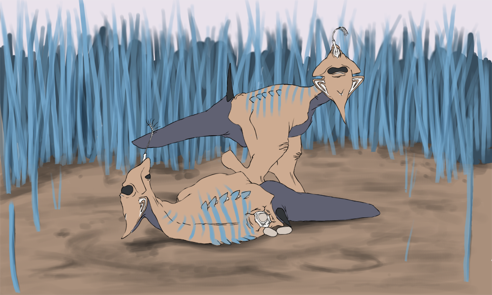
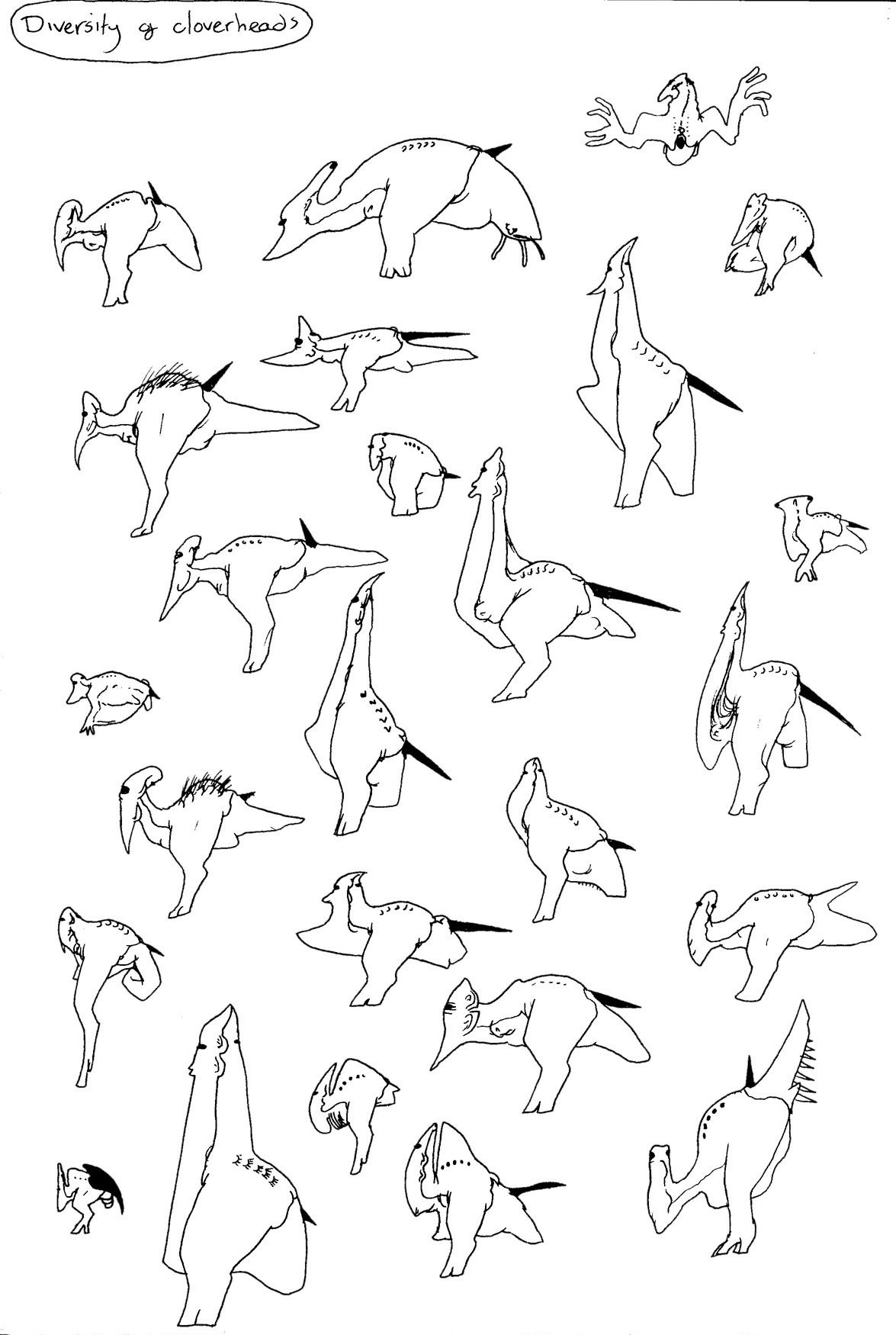
So it's some Cloverheads, mammal-like creatures that live in various parts on the planet, filling all kinds of niches. Like all Fentil vertebrates, they feed with a mouth located at the rear end of their body. This suits the majority of Fentil vertebrates, which graze on ground plants. Some, however, have become predatory (while remaining herbivorous due to the mobile plants) and have adapted ways to hunt and eat their strange prey. This particular species has a sharp blade on their 'chin' which they use to spear and lacerate plant prey. Their tail can then fold forward underneath their body and feed.
ALSO
I've continued on the little raptor thinger.
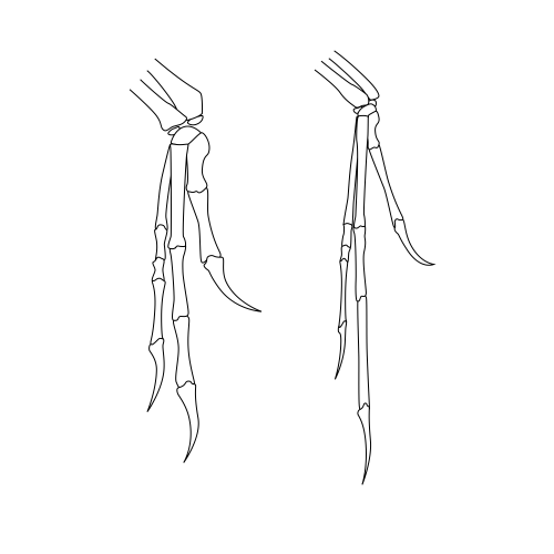
Those hands look weird
Feet!
I'm going to go full-out and texture it, too. I figured that because it's a fairly low-poly model, unwrapping shouldn't take too long...
Ughhhhhhhhh
I'll probably tweak the hands. I was going for this:
The one on the left
Though I'm not going for any one type of raptor (the glaring anatomical issues give that away) but I still want to get those hands right. I think a lack of reference is probably responsible for that.
Don't worry, though.
I've got some more modeling practice lined up, for which I WILL use reference: This guy
This guy (?)
Probably an exercise in bump-mapping, too. Not too sure how I'll model it, though.
This thing
Nice simple lemon-shape. It's an amphibious Titan life form I imaginised
This Moai (from an old dream)
It tried to kill me by headbutting me.
And probably one of these
Or something else Fentil related, perhaps a balloon worm. Who knows.
I'm sure I'll be capable of getting it all done. Hopefully.
...One more left. That's a scary thought. I'd better start whoring myself out to companies for possible animation jobs.
I look good in metaphorical fishnets.
Well here's my finished Watch piece for our negotiated brief.
Now some works in progress:
Animatic
WIP1
WIP2
I'm happy with how the short turned out. I chose to animate the shot in Flash because it is a piece of software that I am very familiar with and I would not have to spend time learning another program and could begin right away with animating. However, it took a little longer to animate than I had planned, which was mostly to do with improper time management.
The watch’s run took some time to refine.
Initially, the run was too bouncy and energetic, (#1) and did not reflect that the watch was exhausted. The legs stretched out too far, and the watch was airborne at one point. The arms, however, were limp enough to show that the character has no energy left. The second attempt (#2) turned out better. The watch seemed heavier and more sluggish, but his run had now become a walk, and would not cross the screen without a large degree of foot-skid. Adding more of a flop to the straps also helped convey the limpness of his entire body. The added sweat droplets are a good cartoon staple to show exhaustion, but they could perhaps remain visible for slightly longer. The third iteration (#3) is merely a refined version of the second. I ended up removing a frame from the cycle so he looked as if he was putting all of his effort into just taking these steps, but glides along for the rest of the cycle, almost like an exhausted jog. I also added more limpness to the strap.
The short itself has been cut down by about a third. The original time (as seen in the animatic and storyboard) is 27 seconds, and the final time is 18 seconds. I did this because the extra 9 seconds after the initial punch-line added nothing to the humor of the joke, and so would have been unnecessary to animate.
My next bit was all about our Pitch Project - we'd been working on pitching a game called 'Renascentia', set during the fire of London. It was an episodic game with 6 characters, each with their own story through the burning labyrinth of London's burning streets. One of the pieces of character concept art was for Richard Quigley, a young Royal Guard.
And now, at the request of Olly, here's my analysis I did a month or so ago (with added pictures)...
Analysis of an animated work: Dead Space 2
For this analysis I will be focusing on the visual/audio aspects of Dead Space 2; a third person shooter, Sci-Fi horror game released for XBOX 360, PlayStation 3 and PC. It was produced by Visceral Games and published by Electronic Arts. It was released in January 2011.
Dead Space 2 is a unique game due to its complete use of diegetic elements instead of a traditional Heads Up Display (HUD) system to convey information to players. Diegetic elements are those which physically occur in the game world - both player and characters are aware of them. The game uses holograms as the only method of user interaction within the game. Everything that needs to be conveyed to the player is done via these holograms - even the health bar, a piece of information usually placed on an unambiguous HUD, finds itself as a vertical, tube-like hologram running up the protagonist’s spine. These holograms are explained in the fiction - all personnel on the ‘Sprawl’, the space station where the game is set, have these ‘R.I.G.s’ on their backs to monitor health and fitness. The holographic video projectors used in the game are also standard issue for everyone you encounter and see on the Sprawl. These glowing holograms also allow the player to see Isaac’s health and menus in the mostly-dark game environments.
The common acceptance of these technologies among the game’s cast makes them more tangible and cemented within the game world - they believe it, so we believe it. The use of a health bar in itself is surprising, as many contemporary games now make use of meta-perception for this:
“These are informational elements emulating what could be described as the internal human perception, linking the player to the senses of his/her game avatar in order to typically convey the effects of physical damage and changed health status. As non-diegetic elements, meta-perception is presented in an overlay manner as full screen image distortion or filtering to divulge the health of the player”(Fagerholt & Lorentzon, 2009).
This can take the form of a red filter to indicate low health or simply the sound of a heart beat. Even the method of aiming in Dead Space 2 is integrated into the environment - blue laser sights are used to show where your weapon is pointing. The beams of these lasers are also visible, and they stop once they hit the environment, rolling off the geometry as a real laser would. These lasers, while a realistic representation of real-world tools, are not as easy to aim in a rushed situation compared to traditional HUD elements. Dead Space 2 is more action-oriented than it’s predecessor, and to accommodate for this, Dead Space 2 has the option to use an overlay-style aiming reticule. While this may make gameplay easier during a few cinematic sequences with awkward camera angles, it breaks the immersion built up by the rest of the diegetic elements. This highlights the issue of balancing immersion of diegetic interfaces for ease of gameplay.
The use of a purely diegetic interface allows the player to become more immersed in the game. There are no ‘out of game’ distractions, so they can focus entirely on the game world. Accessing these menus does not pause the game, either - opening a menu, store or upgrade bench hologram still leaves the player vulnerable to attack. You are always at risk. As stated by Erik Fagerholt and Magnus Lorentzon’s ,‘the diegetic element is an excellent tool for strengthening the game experience from an immersion point of view.’ (Fagerholt and Lorentzon, 2009: 73)
The lack of HUD makes the game appear more cinematic, with the camera hovering behind Isaac, giving the impression that we as the audience are following him through the space station - in a similar way to films following the protagonist. Another interesting aspect of the camera in Dead Space 2 is how it composes the image. There is a clear yielding to the rule of thirds used in photography, with Isaac almost always occupying the left part of the screen during gameplay, no matter where the camera faces (except during some cinematic sequences). This is an example of games adopting standards and rules of other media, a process known as ‘remediation’.
‘This is all any new technology can do: define itself in relationship to earlier technologies of representation” (Bolter and Grusin, 1999: 28) This not only makes for a stronger, more interesting composition - it also allows for a larger area of screen space to be used to show the environment. Also, keeping Isaac’s body constantly in shot makes sure the player can always easily see the health bar on his back.
Dead Space 2 borrows heavily from techniques used in horror films, both visually and with sound. It was praised by critics for its audio, both for sound effects and musical score, ‘The score is nearly perfect. The creaks of the Sprawl and moans of the Necromorphs meld for maximum scares.’ (Miller, 2011). Throughout the game, there are various ‘sting’ moments; scripted events where something startling happens briefly, and then stops. This is usually accompanied with a audible ‘sting’, such as a high violin note. An example of this dual sting in Dead Space 2, is when the player stands close to a window in a particular room to look out at space, a necromorph scurries up the glass on the outside, this triggers the audio sting. If the player does not stand by the window in a certain time period, the sting event happens anyway. Either the player will see it from another point in the room, or they will just hear it, knowing they missed something. This is one of the benefits of games over film for creating a tense atmosphere, you can craft multiple situations for different choices the player may take, each encounter can be made different and unfamiliar. Dead Space 2 borrows heavily from film form, and from action and horror films especially. Ultimately, however, it brings a new level of depth to these standards because of its interactivity.
--- Websites: http://uk.ps3.ign.com/articles/114/1145331p1.html Miller, Greg. (2011) Dead Space 2 Review. IGN.
Journals: Fagerholt, Erik and Lorentzon, Magnus. (2009). Beyond the HUD: User Interfaces for Increased Player Immersion in FPS Games. EA DICE.
Bolter, Jay David and Grusin, Richard. (1999). Immediacy, Hypermediacy and Remediation. In Remediation: Understanding New Media. MIT Press. --- I'm pretty pleased with it. In related news, twoguys from Visceral are following me on Twitter. Get me. I may have to work up the courage to bother Dino Ignacio (the lead UI guy on Dead Space) for an interview, because one of the major parts of my future dissertation talks about diegesis and user interfaces.
Because this song is too beautiful not to have to listen to it again. That, and the last link broke, plus this is a clean and scanned version. So bonus for you, really. You practically owe me.
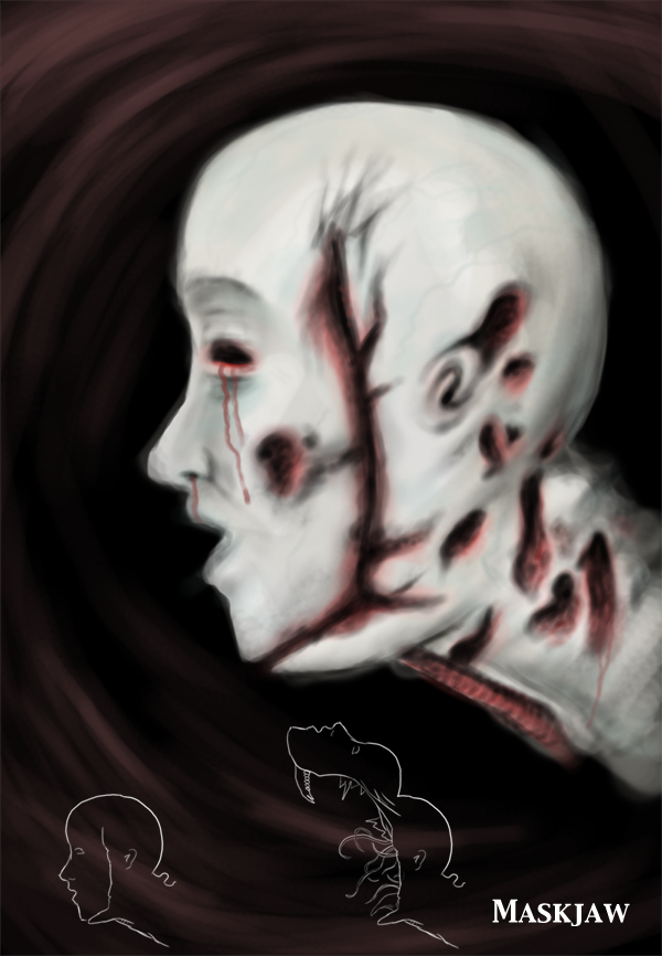
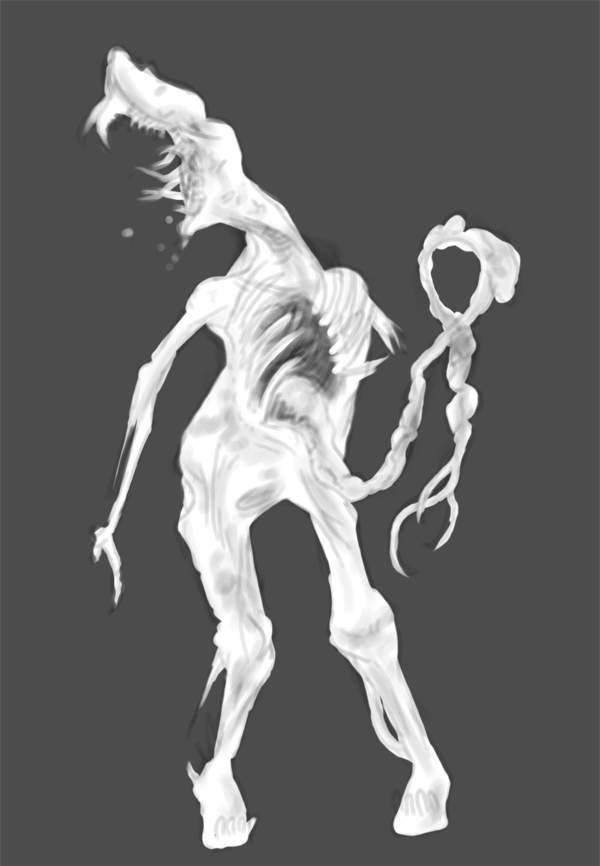
Maskjaw
Dead bodies are not green - take that traditional zombies.
The maskjaw is a corpse-like beast that blindly stalks the dark corridors. If it notices you, it will turn and being limping in your direction. When it gets close enough, its ribs open and out shoots an improvised tentacle of digestive tract. It uses this rope to pull you in, and hold you captive within the rib cage, at which point its head unhinges and descends onto your own, slicing and rasping with shards of bone and tiny, radula-like tentacles emanating from the ornate inner-skull structure. This guy was a nice little Photoshop painting refresher. Initially I started with a black and white shade, then added the expired yellows, blues and reds afterwards. Mmm.
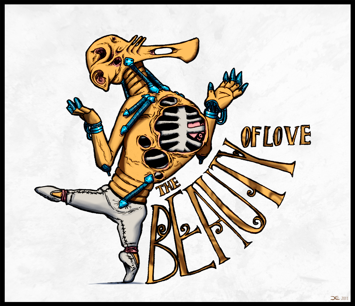
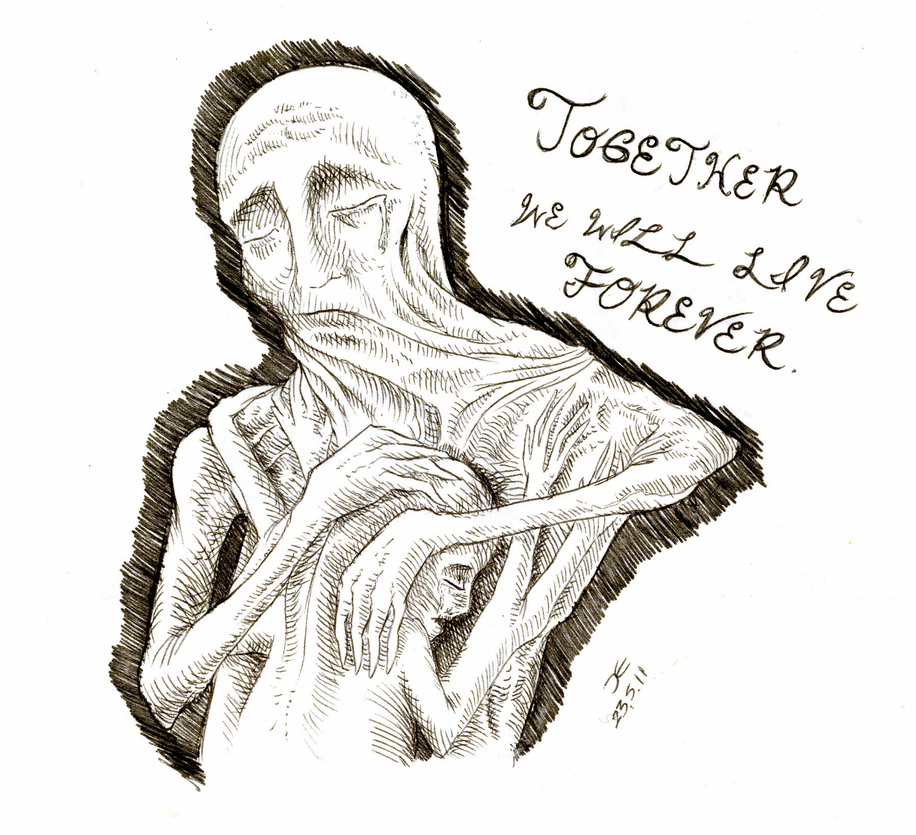
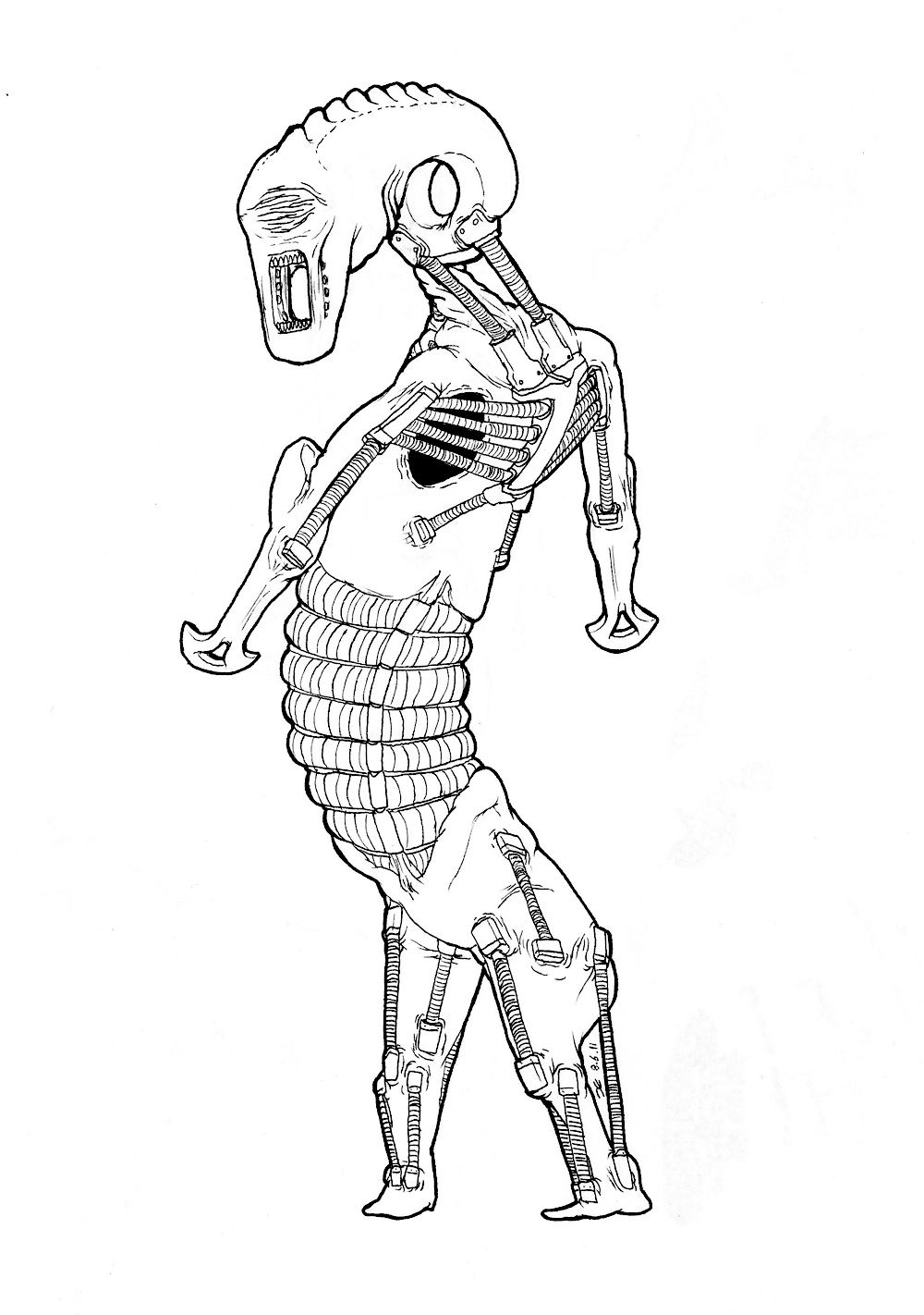
Lanky man
Yet another guy with synthetic muscles over his body. I'm really starting to like the look of it. I'll keep refining it until it looks as good as it can. I'm trying to emulate real muscles position with these synthetic muscles, but not too much that they become too useful or look too natural. I want them to give a sense of performance, but only just enough. I'm going to colour these two eventually. I'm thinking orange for the skin, but I'm not sure why - it just seems to fit. Maybe blue/grey for the muscles? Get some nice colour theory all up in this joint.
Bitch please.
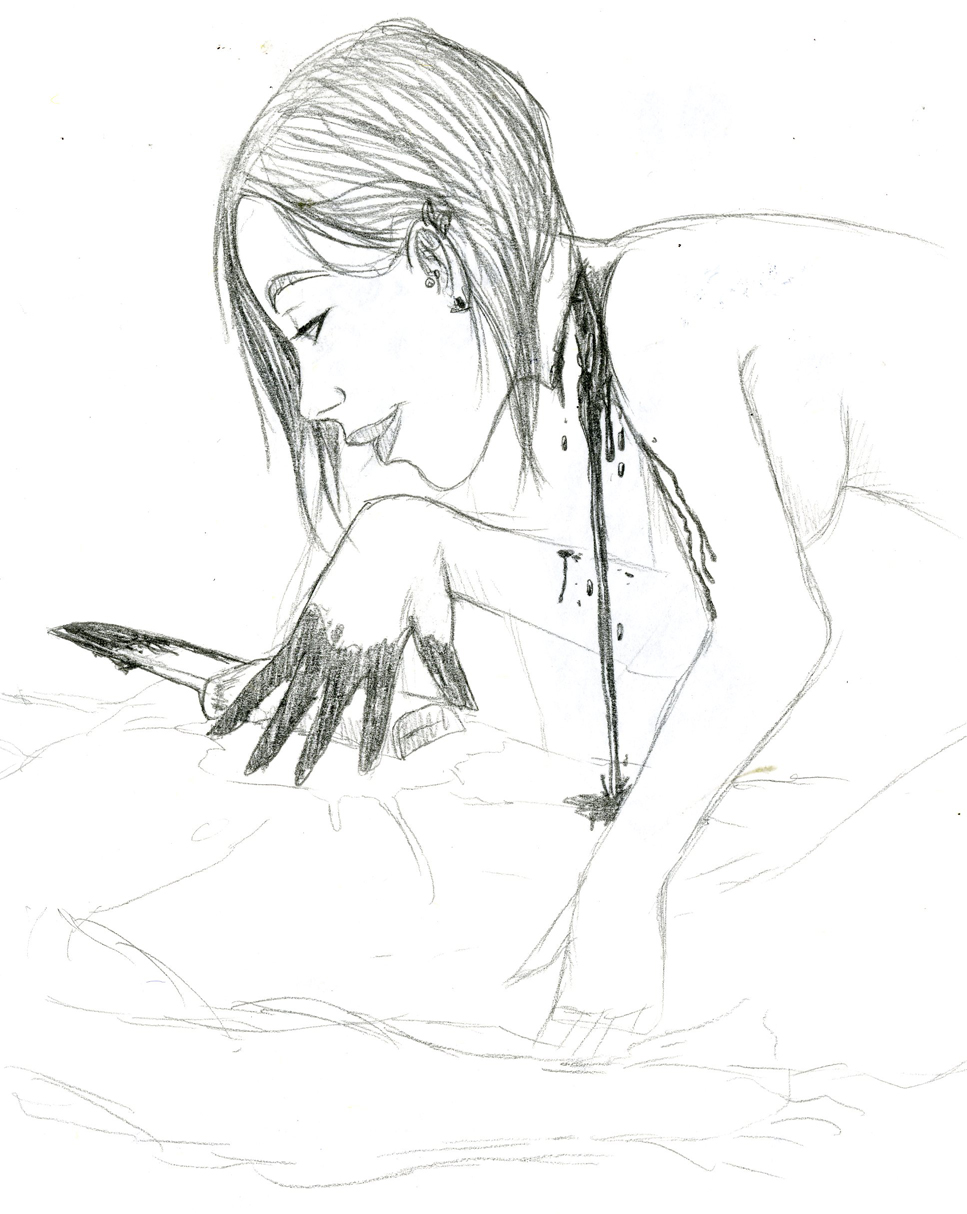
Sanguine
This was originally just an exercise to draw profiles, but by the time I finished the face I got tired and carried on without really thinking what I was doing. And, well, here it is. How romantic. (It's pretty faint, but his right hand is holding her head up)
AND finally, some cool stuff to watch:
Smutley
This is an ad made in France to raise awareness of AIDS. I think these kinds of ads really do the job. I really like the throwback to the old 20's cartoons. Plus, his little dance is so cute
Aw, he came
So yeah, I'm now pretty excited about this game. I'm a lot less skeptical about the art style now. Or maybe it's just nostalgia kicking in. It will give me a reason to fire up the Wii again, I just need to find a way to connect it to my monitor. Also, the soundtrack is Zelda's Lullaby played backwards. My mind was blown.
Aw, he came
Additionally, I quite like the birds, and I'm sensing perhaps some Avatar-esque flying bits with Link and Zelda. I'm also pretty sure the birds were inspire by shoebill storks.
I wonder if eating ducks is a pivotal gameplay element?
Well, that's all for now. I'm going to be busy during the holidays so I don't get bored. I'll be working on my 3D stuff, so modeling, animation, rigging etc. I really need my 3D skills to catch up with my 2D. I've been neglecting the dinosaur. Although he was never meant to be anything serious, I'll finish him eventually. Hell, maybe I'll even use a reference....


 derp
derp