My wow image is going to be based off of this basic composition I did in Maya with my blocky models.
I'll just trace over it and flesh out the creatures, the composition helping with perspective, colours etc. I'm also planning to add HUD from the probe camera (this explains the extremely close camera) and perhaps even a crack on the lens (which explains why the 'photo' will be blurry). I've foolishly left this until quite late and so there's a possibility of it not being finished in time for the hand-in. Failing that, I'll use one of my Pitch slides.
Such as these:
I really like that grey grid - which is good because I'll be using it a lot for the whole Fentil project.
So I should probably get on that whole wow image business!
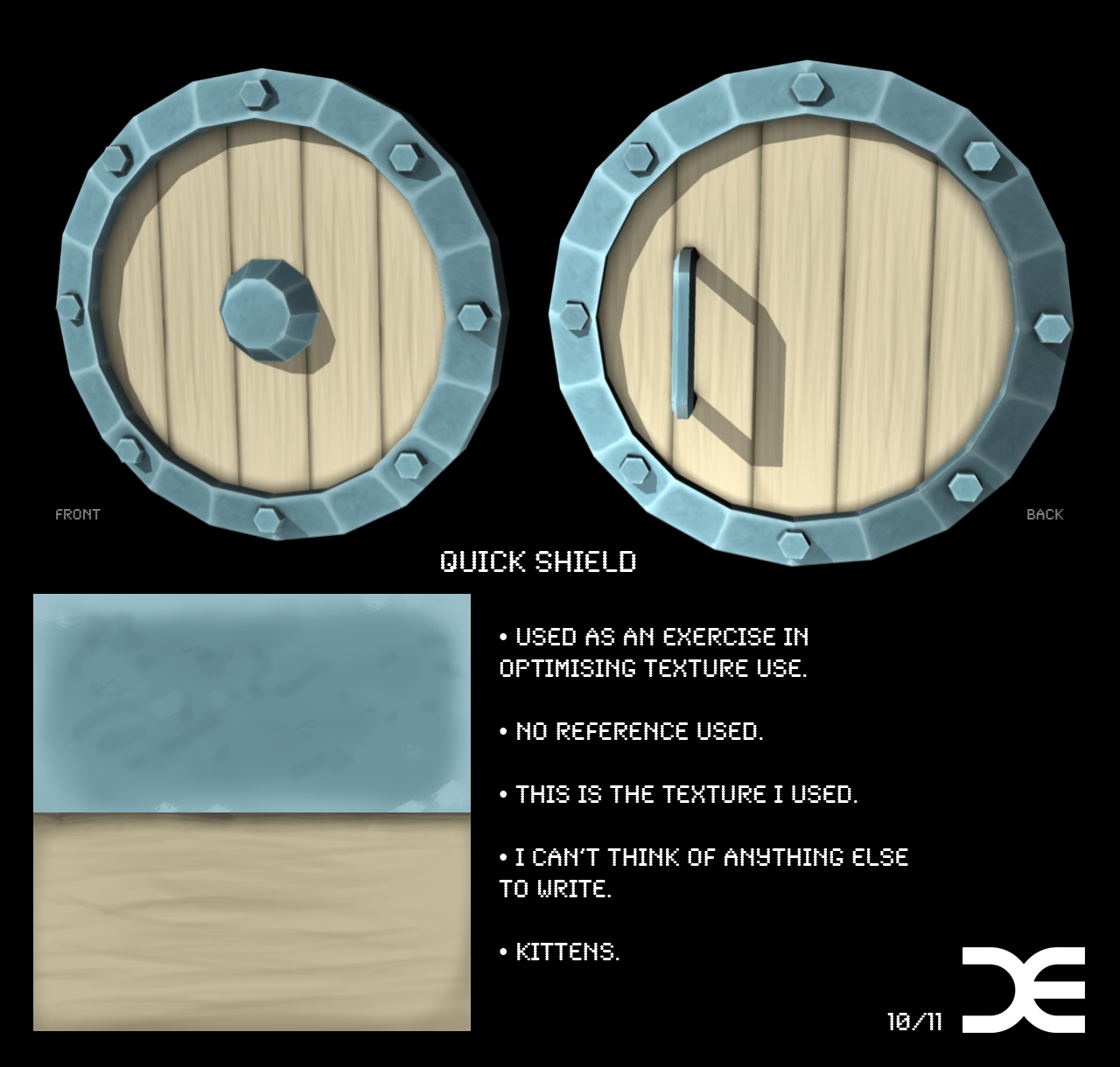
Oh yeah, and completely nothing to do with anything - A few months ago I made this shield:

It was vaguely based on the visual style of the upcoming Skyward Sword and one of the shields.

Now time for some things to watch:
The Backwater Gospel
Making of:
I like how in their pitch they break down how they make their wonderfully stylized characters. It's a wonderful insight and I'm sure that they had a very
successful pitch. I also really like how they rigged their mouths, using independent sprites for the phonemes. They also included their animatic which is useful research for making my own animatic (see last post).
Extra
A cool music video by the director of Akira , Ken Ishii.
Done!


No comments:
Post a Comment