Showing posts with label sketchbook. Show all posts

Sunday, 29 April 2012

Love Hate, girly skate and no more 3D animate.

So Kernel's animation is all done.
This is quite a major milestone.
That's not entirely true, there are still some tweaks to be done to certain shots and I'm still adding the beautiful details in Kernel's final shot, such as floating debris, flapping fabric and organic growth. I'm actually pretty proud of the shot's animation, so I can only wait to see it rendered once it's finished.
I'm also going to be playing a part in Kernel's sound design now that my place as Animation Director is no longer needed. This will include not only foley but the grunts and groans of Leonard himself. That's right. I will BE Leonard.
Pictured: Me.

Now that my animation 'talents' are no longer needed on Kernel, I'm helping other projects with their animation as well.
One of these is Alice's Love Hate, which is VoxPop short film, similar in principle to Aardman's Creature Comforts, only in 2D.

This bit is of an interview with a young boy who hates everything. I drew these lines in flash, but after animating I was told that they are too clean, and didn't fit Love Hate's more sketchy cut-out look. In an attempt to save time, I tried Photoshop's batch process action to apply a filter to the whole image sequence.
These are the most qualifying filters

The batch process is actually pretty useful, and I also discovered how Actions work, and seems like a great way to give multiple images the same 'feel' with ease. I'll definitely be trying it out in the future. Here are the 'Splatter' and 'Cutout' filters applied to the animation:


Turn it up to 1080 HD and fullscreen, please.

The 'cutout' filter makes it look like the frames have been drawn with a heavy ink pen, wheres the 'splatter' filter makes it looks like it's crawling with spiders.
I feel that the filters will end up not working, and I'll have to just draw over the original lines which won't be difficult, but I will definitely be tedious. This is what interns are for.

In conjunction with our 'professional practice', I have been working on marketing and self promotion.
I've already got a basic website up and running, but lately I've been working on two other approaches. One is a basic idea for my business card:

'front'
'back'

I decided to not have a definite front or back to the design (hence the 'quotation marks') because to me it just makes sense to have information on both sides. Why would you have information squished up in tiny font on only one side and leave the other blank? The basic design philosophy for these is that I create very graphic designs such as logos and layouts, but inside the white space there is also the weird organic stuff I doodle and draw. It gets my point across before they've even read anything. I'm still refining it, and I don't want to go for this first design because that feels too easy .

The other piece of advertising is printed Tshirts:

This is a test I ordered from CafePress. It cost £20, which isn't too bad seeing as that includes shipping and it's a good quality T-shirt, not some paper thin transparent sliver of cotton. It's a print of this drawing:
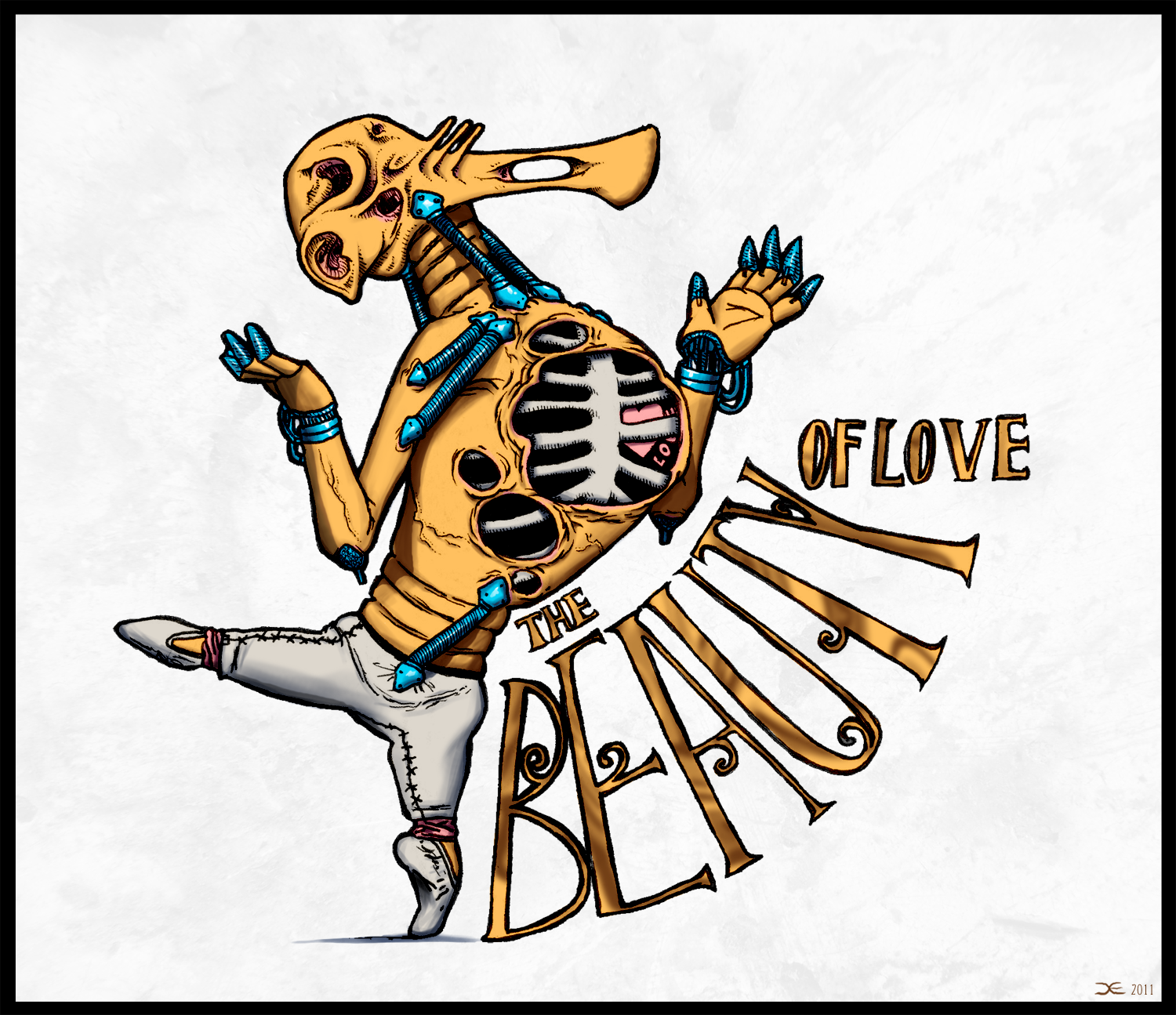
Considering I didn't change anything to make printing easier, such as adding halftone-dots for shadows or playing with contrast, the design came out perfectly. Much better than I expected. I also have my logo and website address on the back collar (so people know where to find other things like this).

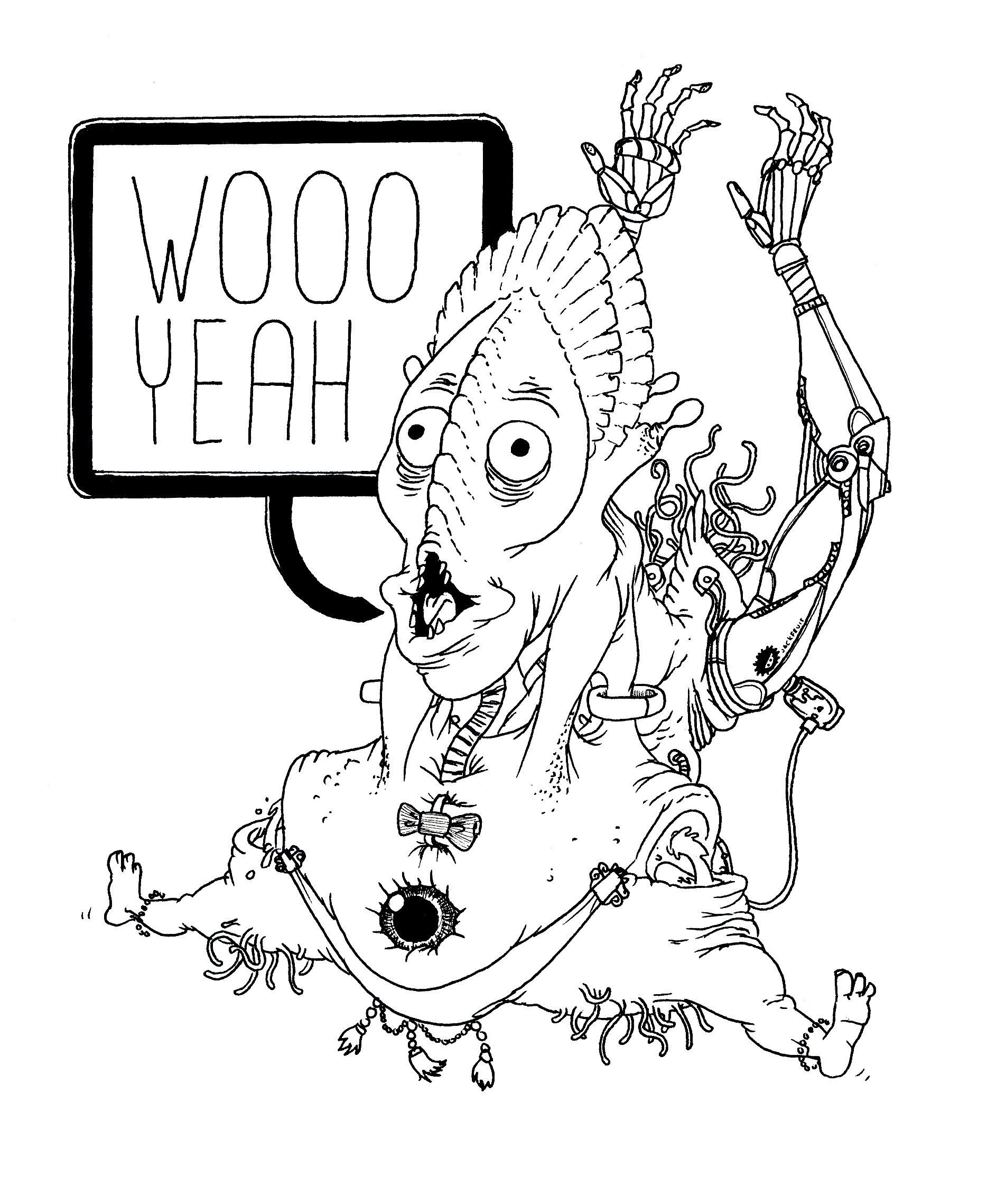
I have a similar drawing on the way, and I'm definitely considering making it into a T-shirt. This one:
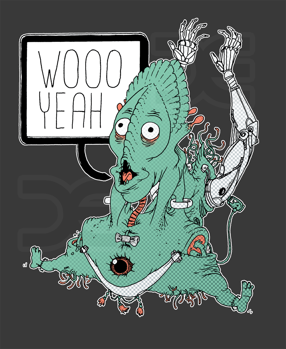

There won't be any watermarks on the final design, plus the colouring isn't finished.

Woo Yeah is going to be coloured and shaded with halftone dots and other things that work better with screen printing. The best advice is to avoid gradients, which can make the shadows look a bit blurry and add colour noise where the colour should be completely flat. For some reason the halftone dot filter in Photoshop uses a gradient as opposed to smaller dots, which I need to figure out how to fix.
Finally I am doing some animation for Insa Burch's 1890, a documentary about the plight of Female skaters. The film features live-action footage with composited animation integrated into the scenes.
These are just stand-ins for position and scale. The final designs will be closer to Insa's hand-drawn, almost woodcut drawing style.

I'm only doing this one shot for the moment, as I'm still unsure of my availability and I don't want to promise work I can't do.

That's all for now. Back to busy work.

Sunday, 22 April 2012

HexMap and Happenings

After working non-stop on a big block of animation for Kernel, I decided to take the weekend working on other projects, ready for Kernel first thing on Monday.

This film is looking goooooood

One under-attended project is Jackson Tayler's projection system, HexMap .
I decided to make a couple of loops for the project, all of which with a running thing of cubes/voxels due to the nature of the system.
These loops are inspired by three main sources:

Voxatron

This is a fun Indie game made by developers Lexaloffle

Voxatron is a simple twin-stick-style shooter rendered in beautiful voxels. The environments are even destructible, crumbling into voxel rubble if the player removes their foundations. One of my favourite things about Voxatron is that if an enemy or object clips off the lower edge of the screen, their fully fleshed out interior is visible. I feel like this mechanic could have been exploited more thoroughly, because it's not a mechanic the most games can pull off with their silly polygons.

3D DOT GAME HEROES

A game that re-imagines old-school RPG's in both visual style, gameplay and difficulty. The entire game is made of voxels, and has some lovely lighting effects.

And finally there's Pixels by Patrick Jean.

This beautiful piece of post-production speaks for itself. Just watch it if you haven't already. I love the glassy/waxy effect on the pixels, and how the Earth becomes a lower and lower resolution block.
Now back to Hexmap. The first Loop I managed to finish was a swimming Voxel Shark. Here's the work in progress:


After finding some reference, I made the shark's profile.

I originally intended to do an exploded diagram of all of the shark's voxelly innards. I abandoned the idea soon after realizing how long it would take. I may consider it once I finish some sort of shark loop.

And here is the finished product - All rendered to perfection.

And here it is swimming. hand animated voxel by voxel.
This shark came out much much MUCH better than I was expecting. I'm genuinely impressed and surprised with how it looks. Hooray for me.

for this task I was tempted to use a piece of voxelising software to convert regular polygon mesh into voxels.


I heard however, that voxelising software can be buggy. I haven't had the chance to give the software a go, so it could potentially be brilliant. I like doing it by hand, though, it feels more 'crafted'.
I am still yet to immerse the shark in a HexMap template due to some issues with Maya crashing when saving - but I plan on making the shark move around the Z-X axis to make the swimming a bit more animated. Also adding some bubbles moving through the water would make the shark look like it's travelling. Also, potentially, a sea floor with an animated pixel texture to synthesize the appearance of movement. That will be a mission for either what remains of the evening or tomorrow morning.

Another loop I produced is a beating cube heart.
I initially began a few months ago with these tests (and their nauseating moving lights):


But I had forgotten about them whilst working on Kernel. This weekend, however, I re-rendered the heart and made it HD, brighter and more intense:


Focusing mostly on animation means that I very rarely render anything, so these two short loops provided some challenges and learning experiences (I still have to look up how to render an ambient occlusion pass). Also playing around with the colour correction in After Effects led tho this other render of the heart:


 I quite like it, but I don't think it'll be as popular as the red heart. I've never really played around with post-processing because back in my youth animating in Flash, I'd do all of the colours in Flash itself (making uploading to sites like Newgrounds much easier) so tinkering with effects like bloom and motion blur in post doesn't really occur to me.

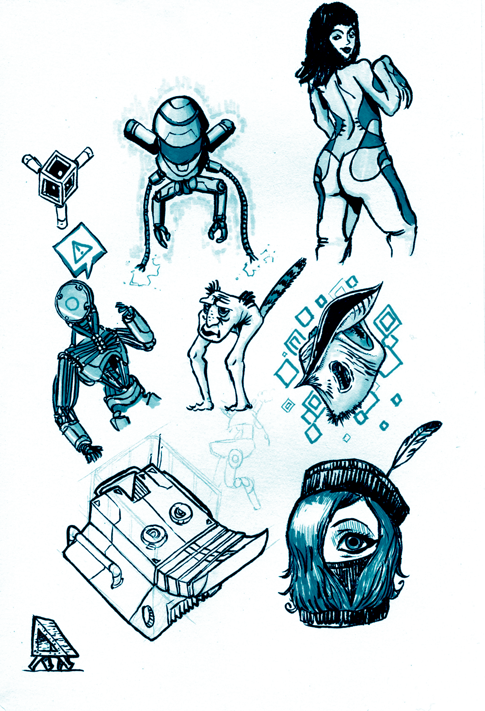
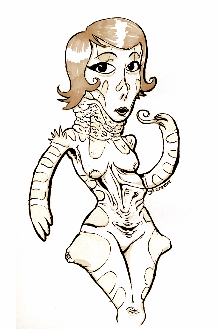
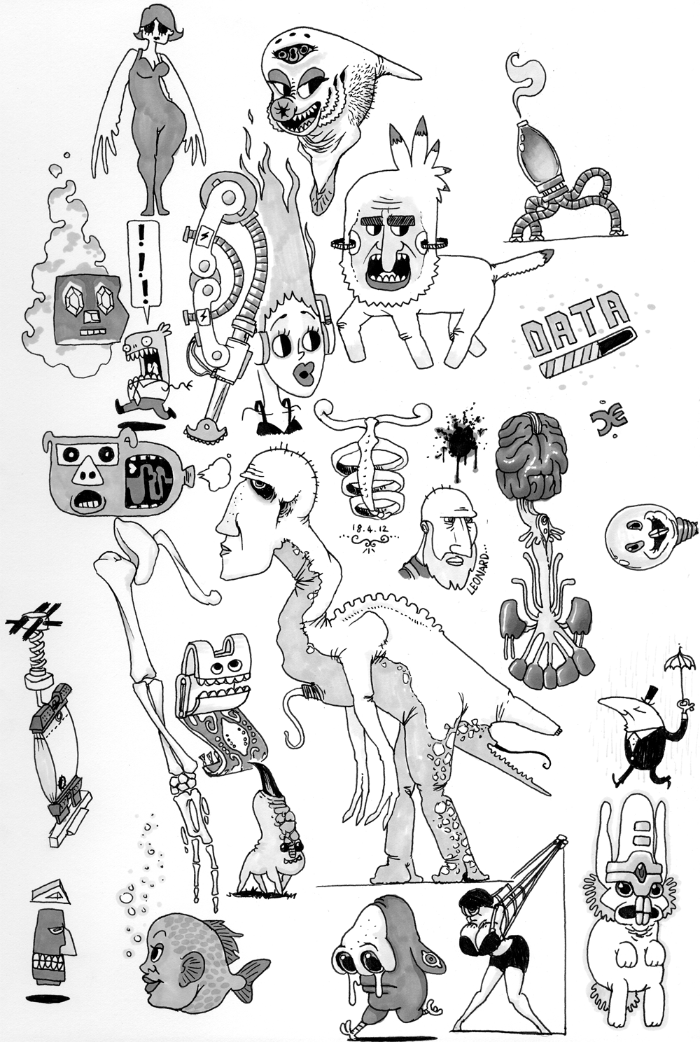
I've been doing a lot more pen/biro/marker work lately (mostly to fill the time made by play-blasting animation) but I'm getting more confident with blending and shading with them. Take a look:

Blue Page

Posing Lady

More Markers

Woman and Friend

Woo Yeah!

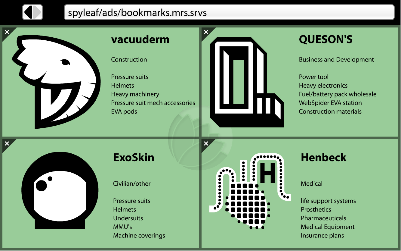
Other, non-paper experiments include some mock ads for fictional companies as an exercise in designing logos:

Spyleaf Ads [1]


Once piece of feedback described the Henbeck Medical company's logo as 'too busy'. I can see where they're coming from, but the aim of the logo was to convey careful intricacy, and the black 'pixels' overlaying the white heart is meant to reflect the company's devotion and development of prosthetics and artificial implants. One of which being AG NODES, which I will discuss in a later blog post.

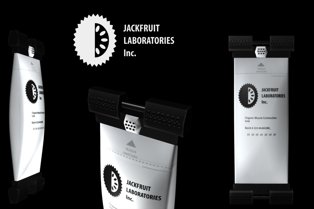
Another flight of fancy is this fictional method of providing artificial meat and muscle for prosthetics, which I spent a weekend creating in Maya.
Jackfruit Inc. Muscle Packet


To avoid the assaults and accusations of Animal Rights activists, several companies turned to other ways to provide meat. Some tried producing non-meat alternatives, which while financially viable, never really caught on as the replacement meat. Others grew designer animals which lacked capacity for pain and produced large quantities of muscle. There is, however, issues with hormones contained within the meat.
Jackfruit inc, a biotech company, took the approach of stretching muscle tissue across two bars and using electrical pulses to cause it to contract. An extension of this technology resulted in small meat 'packets', which are fastened to an elasticated conveyor belt and take a matter of weeks to grow to an edible food source.

The company is also collaborating with prosthetics industries to provide natural muscle for basic artificial limbs and synthetic pets.

The company founder Whilton Jack - an eccentric man - uses these packets in his prosthetic leg, and was quoted as saying:
"Sometimes I like to take the pack from my prosthetic and use it for dinner. I like to eat my leg"

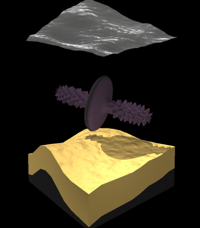
Another quick Maya experiment was to model some potential aliens for another speculative biology project alongside Fentil (remember that?) which explores the life that may be inhabiting Saturn's amber-veiled moon, Titan with its thick atmosphere and methane lakes.
So here is a Titan 'Fish'.


They swim through the water by spinning their bodies and modifying the shape, size and angle of the small paddles on their sides.

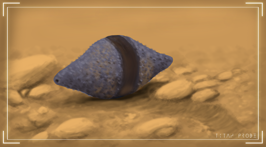
They are the origin of the body plan for Titan amphibians such as this purple studded lemon thing.


And finally I have a website up and running (sort of).
That's right, DoodleDemmy.co.uk is up and running. Even though it's just an HTML skeleton at the moment, I finally have a place to direct potential clients and anyone who is interested in my work, instead of having to direct them to YouTube and explain/apologise for my various internet aliases. Over the coming weeks I'll be improving the look of the site. Initially I was going to use Wordpress to build the site, but the famous '5 minute instillation' is a bit misleading, as it doesn't include getting database management software nonsense to simple install the Wordpress builder in the first place. So for now, HTML will do fine. I feel a little gutted that I no longer have Dreamweaver (I couldn't exchange it for a new OS copy when I got my new computer) so all my HTML and CSS is going to have to be re-learned. I'm still looking for a decent (free) replacement, but for the moment I'm using sites like www.w3schools.com to learn the basics once more. It has an HTML preview window used for individual lessons it teaches you, but it works with any HTML so you can just enter your website's code to see how it looks and tweak it as necessary.
Feel free to go to my website and click the links - I promise they'll be interesting.

Monday, 20 February 2012

The masochism of late-night brain befrazzlement.

2:30 AM

After a few months of being good and going to bed at a half-decent time, I've started doing all-nighters again.
I know I shouldn't. Every time. I will always regret it in the morning after 3 hours sleep and the taste of stale coke and tea in my mouth.

So why do I do it?

As I work late into the night, listening to Deadmau5, Daft Punk and in tonight's case, this guy- time stops. The concept of the impending deadline vanishes. I have all the time in the universe to finish what I'm doing. Perhaps it simply reminds me of my younger days, spending hours and hours creating art and animation, regularly and willingly working until the early morning. Getting up in time for school didn't matter when I was crafting my one-man masterpieces.
Despite my love for this animation course, and all the people in it, I still sometimes wonder if I was more productive animation-wise before I came here, when animation was just a hobby and not a career choice.
Anyway.

Perhaps the enjoyment of these all-nighters is the feeling of accomplishment; that you've won the battle against biology to meet your goal. The relentless drive of the mind has won over the failings and protests of the body. And a battle it is. The best comparison I can think of is carrying a heavy sack of chicken feed on your back. You know, that thing people do all the time.
It's relatively easy to stay upright and carry it as long as you put the effort into balancing. If you don't put in the extra effort into balance, your strength lifting the sack is wasted and you come crashing down, spraying your chicken dinner all over the ground. What I'm trying to say here is that it's not the actual working that is the hard part for me, it's constantly keeping my stamina up to stay awake. One slip and boom I'm asleep. This to me is the closest thing I can describe as the 'extra gear'.

The fruits of this extra gear?
Well:
After making the 'Ice Cold' logo for Red Bar Radio, I felt inspired to make another piece of art for another favourite podcast, Distorted View.

Don't judge me by my choice of podcasts.

The basic idea was to have the show's host, Tim Henson, in a Pedobear outfit beckoning children in. His idea was to have the advertisement he described on school buses and posters, in response to a news story of Texas schools selling advertising space on the property.

On a subject of less ambiguous morals, I have compiled and combined the Fentil doodles and EVA doodles in my sketchbook from the last two months.

Hm, not as much as I'd expected.
I still have yet to combine the Machina and Weird doodles, but those will be for another post, soon.

Now back to this darned dissertation.

Sunday, 19 February 2012

Yet another backlog

Sigh.

I really need to get into the habit of writing smaller posts more frequently.
This is going to be a long one.

First thing's first - Kernel

As semi-self appointed animation director, my job is to give Kernel it's animation style and direction. After consulting with Olly, the real director, we came upon the possibility of an almost stop-motion feel for the animation, especially after this first animated shot. With the amazing work that everyone has put into modeling, texturing, rigging and lighting, it certainly would be an interesting way to go.

Impressed?

The discussion also reminded me of how the Prawns were animated in District 9, with very little use of 'tweening' and lots of subtle keyframes. This apparently gives them a more organic look. See for yourself.

He also suggested films such as the Backwater Gospel:

How many times is this going to feature on my blog?

And Little Tombstone:

LITTLE TOMBSTONE - ESMA 2011 from Little Tombstone on Vimeo.

To use as inspiration.

I'll be compiling a little information package with this information and more for the future animators on this project in order to keep a consistent look throughout the film. I finally feel useful.

Now, H0le:

I haven't been working on H0le as much as I should be.
I have, however, finished the rough animation for that climbing shot:

This was my first real attempt at ToonBoom, and I feel that this slowed me right down. I've decided to do the rough animation in Flash. I am much more familiar with Flash and this rough animation can be exported as an image sequence that can then be imported into ToonBoom for the cleanup artists.

Now onto some personal business...

One of the regular podcasts that I listen to is Red Bar Radio. The host called out for fans to design a logo for a joke drink 'Mike's Ice Cold Diarrhea', which was to be put on t-shirts and other items. The 'brief' was simply to resemble old root beer labels.


Here's my attempt. Sadly I submitted the design a day too late and was not chosen, although I was given positive feedback by others of the Red Bar Radio community.
This is the first time I've ever worked on anything for t-shirts, and I had to learn a few things, such as having to use the half-tone dot effect for shadows. It was a fun experiment, even if I didn't get picked.

I've also been playing Zelda recently, and I noticed some cool effects.
The first from Skyward Sword is this cool diamond-shiny effect.


So I tried to emulate this effect thanks to ol' Leonard, here. It seemed to be simply the matter of plugging a rotated checker-board pattern into the eccentricity of the shader and boom!

Old Man Ghirahim.

In another attempt to copy something Zelda-y, I wanted to have a quick go at this effect in Twilight Princess:


here, the darkest areas and shadows are transparent, leaving only illuminated areas visible. This gives a lovely ghost effect, reminding me of the technique used for projecting ghosts on theater stages, known as "Pepper's Ghost".

The technique

The effect

So I had a little play around with Maya's nodes and did some connecting on the faithful Platehead model:


This one used the sampler.Info.node>Camera facing ratio (used to make simple rim lights)and connected it to the transparency.


Here I plugged Surface Luminance (duh) into transparency, which has a much better effect and is more physically resembling of the Pepper's ghost technique.


Some tweaking and different angles.

What I like about copying techniques used in Zelda games is that they're cheap. The Wii is a runt in terms of processing power, and so Nintendo can't afford to use fancy shaders for everything and have to find the effect another way.
I feel that it is always best to find the most economical solution, and being able to optimise your work can only be a good thing. Perhaps that's why I have so much love and respect for low poly games. It could just be nostalgia, but there seems to be a certain consciousness and deliberateness in the models. Every extra poly is expensive, and trying to keep to these limits turns it into a much more creative process. The same can be said for any other artistic medium.
Challenge fuels creativity, and without it, we'd still be a bunch of sponges and worms drifting in an ocean.

Finally, here's some drawings that I done do did:

Free Sword


Fi, from Skyward Sword talks a whole unskippable lot. She lives in your sword. That is the joke. Hilarious.

Breaching Octopus


This is from a dream I had a while ago. I was filming the giant swimming octopus in the background, when a pod of smaller octopus began swimming alongside my speedboat like dolphins.

Marker Madness


It's been a while since I've used my markers. It feels nice to shade stuff sometimes.

Now prepare for a WHOLE mess'a drawings!
In the next post. This one is already too long. Plus the drawings need cleaning up.

Be ready!

Tuesday, 13 December 2011

Sorry. I've been busy, alright!? Here, it's a big'n.

There's a lot of ground to cover.

Fentil: Another Life

So after the sweatbox, I have found out that Fentil: Another Life wasn't picked for production.
Sort of.

Instead of green lighting the entire film, we've been okay'd to produce one shot - one extremely realistic, detailed shot. The issue now is to decide which shot will be the most profound.

Fentil: Another Life - Production Bible

While I understand that Another Life was probably too ambitious, due to unforeseen circumstances, I was unable to add to the animatic (using feedback from James Henry, a helpful script writer who came to talk to us). These additions would have added the much needed drama and tension to make the 'baby needs to eat' story tangible.
While they may not be used, here are those extra frames in context.

This would probably have been a much more ambitious project, and the production bible includes the spear dropper and octopoid information.
As for deciding which shot to choose, I really like the Spear Dropper swooping down. The problem is that we have none of those aliens rigged or even modelled. From a realistic standpoint, it has to be one of the Platehead shots.

Oh well.

I've lately been following a guy named Greg Broadmore, who does lots of cool art and works for Weta. He has worked on concept art for District 9, King Kong and other films.


He's basically amazing.
He also has a project called Dr Grordbort's Which is a steampunk vision of old-timey hunters going to other planets to hunt for trophies. Recently, Media Design School in New Zealand has taken on his world and designs and have made a short film of it.
"The Deadliest Game" poster
An 'Aether Oscillator' used by the huntsmen
This is probably my favourite of his aliens. Look for it at OO:16. I really like its legs.

Here's the teaser.
This is what I want Another Life's shot to be like. Pretty.

Rigging

On the same topic of work, I've been doing some rigging for Olly's project: Kernel. I only really have one character to rig (Leonard, the old man) so I can really focus on making him spectacular.
Fabulous

So far we have:
  • Leg IK's
  • Heel Peel
  • Tip Toe
  • Heel pivot
  • Toe Pivot
  • Toe Tap
  • Back rotation controls
I'm also planning on putting in foot roll (side to side) and toe splay (as Leonard is barefoot). I'll also be implementing my lovely eyelid flicky mechanism.
I'll also be looking into rigging his luscious beard.
Gorgeous

This is what I'll be working on until I go back to the parents' place for christmas, where I have no access to fancy animation software. Then it'll be more dissertation work.

Dissertation Business

Somewhat under-represented on this blog (and I suppose many other animator's blogs) is my Dissertation research (the capital 'D' shows how fearful I am of that word).
My basic topic is horror, and my argument is something like "Video games are the perfect medium for Horror, and are much more capable at scaring us than Film."

Rolls off the tongue, I know.

So that's the basic premise, and my goal is to try and prove that video games have the capacity to scare us in ways which film never can and never will. I'll be addressing topics such as immersion, the psychology of horror, why we love to be scared, and the history of Horror as a genre. I will be analysing various horror films and games to get a decent scope. My major case studies, however, will be Silent Hill 2, Amnesia: The Dark Descent and Dead Space 2, as I feel that combined, these games cover most of the horror spectrum. They are also pretty scary.

The most recent book I've been reading is "Projected Fears: Horror Films and American Culture" by Kendall R. Phillips.


It discusses how Horror is very much a contemporary genre, feeding on the fears and unrest in the society it is born from. Be it immigration of Eastern Europeans during Dracula's theatrical release in the '30s, or the fear of advanced military flying machines during the '50s, where most alien invasion movies were born.
The Dead Space series also has this cultural resonance, as it deals with the repercussions of the separation of church and state, a fairly big issue in America at the moment.

Unfortunately, I've been neglecting this written work up until now, so I'll have to work my buns off over the holidays to get this under control.
Wish me luck.

Pictured: Buns

Demmy's Doodles

Despite being busy with all this work, I have also got some nice doodles to show:

Evil Butterfly

Monsters

Just Hanging Out

FlagHunter

Tree Face

King Giblets

Shankbat Taxonomy

I haven't really had time to do any digital work lately.

Theatre.

Watch things:

Story of Genki???
Fun nonsense from the amazing David O'Reilly.

Destructo Box
Destructo Box is my new favourite series. It's clever and funny. Watch it.

First Contact

First Contact from Media Design School on Vimeo.


These are the same guys making/made the 'The Deadliest Game'short.

Now I am back off to swim. Splash.

Loyal Followers