Showing posts with label experimental. Show all posts

Wednesday, 1 December 2010

Endatermo

Or something.

Well with all deadlines behind us, here is my finished experimental piece,

Shrapnel:


I'm really happy with this little animation.
My original idea was something much darker and surreal, revolving around the theme of parasitism, and using raw meat for some of the stop-motion parts.
One of the major problems that I found with this idea was that it seemed far too complex and difficult. I managed to do a few tests, but ultimately I just wasn’t happy with the idea, and so I ended up changing my idea at the last minute.
My new idea was admittedly less experimental, but I still tried to make it mostly new techniques.
The last time I did some paper animating was the ‘Paper Love’ short. I quite liked the simple style of it and I wanted to do something visually similar, but different in style. Initially it was going to be just black and white, but I felt it was too bland, so I added a mid-tone background.
Only about a third of the way through shooting I realized that I had chosen almost the exact same colour as the Paper Love background. I guess I just like those colours.

The main inspiration for the piece was the idea of swarming animals such as birds and fish, and how the individual units move together, split off and rejoin again. I wanted to take the idea one step further to make the amorphous swarms form solid objects periodically, which animate then split off again.

From the beginning of the animation, I had decided to do it all straightforward, with as little planning for the actual animation as possible, as it would make for a more fluid movement of the swarm. I did make dope sheet for the animation, and made some basic plans for what happened. However, once I started moving the bits of paper around, the plans started to crumble, and the intricate dope sheet only became useful for telling me where the beats in the music where, which was all I ended up needing.

The bomb was inspired by the beginning of the short movie, PIXELS, by Patrick Jean, which begins with an 8-bit bomb inside a TV which explodes, sending out a cloud of floating 3D pixels. I guess the more I think about it, the more I see the inspiration. The bomb itself went well; the fuse burned away exactly how I wanted it too. As for the new fuse growing, I simply shot it in reverse, cutting small bits off at a time and then reversing the frames to give the illusion of a growing fuse.

The border of the animation serves two purposes. The first and foremost is to widen the frame to make it fit into a 16:9 window, as the camera only shot on 4:3.
The second was for aesthetics. I chose intricate, baroque patterns, which were contemporary to Vivaldi, himself, so it all fits together. The blend burn effect of the border resembles an old silent film vignette, which helps fit with the old feeling.

The Shrapnel logo was designed to convey the visual style of the animation, and so is made of lots of shattered pieces. However, simply having sharp, angular shards overlooks the gentle overall tempo of the animation and the music, so I added a more stylized, baroque ‘L’

I’m very happy with how the finished animation came out, especially after adding the extra border, which made the footage have a sense of place, as if it’s being projected in an old theatre. I was tempted to add a film-grain effect to give it a more aged appearance, but I decided against it as most of them look a bit cheesy and are generally overused.
I feel it was quite ambitious to shoot it at 25 frames per second, especially as I was already halfway through the allotted time. I managed to condense the actual animation into 4 days of solid work, clocking up about 20 hours work.
Despite the tedious nature of this cut-out stop motion, I do enjoy the outcome. I’m probably most happy with the tentacles, I managed to give them the whipping, twisting look that I was trying to achieve.

Next time I try some experimental animation, I feel that I will definitely have to branch away from paper animation, because it won’t really by experimental by this point.

Here are the two, rather messy dope sheets for the second half.


As you can see, few of the original scribbles and ideas ended up in the final piece, but the red waveform was vital in timing the little pieces of paper.

Finally, one more of the many icons I've been dabbling in:

This is my one for Flash.

It's been a good term overall, and I'm really happy with what I managed to get done.

I'll probably still update this blog over the holidays.

Sunday, 28 November 2010

Finally. Another post.

So the experimental is coming along swimmingly, just 9 seconds left to go, which I'm hoping to get done tomorrow. I just wish I'd started it earlier so I wouldn't be panicking so close to the deadline, but I guess that's what I get for changing ideas so far in.

I'm happy with how things are matching up to the music, but I might still do a few frame tweaks once the whole thing is done.

I haven't been uploading my other WIPs to this blog simply because I've done most of it in the space of a few days, and it seems odd to upload bits each day.
So just incase you're curious - here they are:
Day 1


Day 2


I did do a dopesheet for the last 20 or so seconds, in which I planned for a creature to walk on from the side and then dissolve, but that idea just collapsed as soon as I started animating. With this sort of thing, it's much easier and generally better when you make it up as you go along. I still use the dopesheet to plan out beats and such, but that's about it. It does show, though, as the second half fits much better to the first.

I'm not happy with the stop-motion cameras shooting in 4:3, so I'm thinking of adding a baroque frame to make it wider and hide the black-boxing so it fits 16:9

This is the sort of thing I was thinking of, just wrapped around the outside of the frame.


When not meticulously placing tiny pieces of black paper, I've been getting back into Fentil things and other various artings.


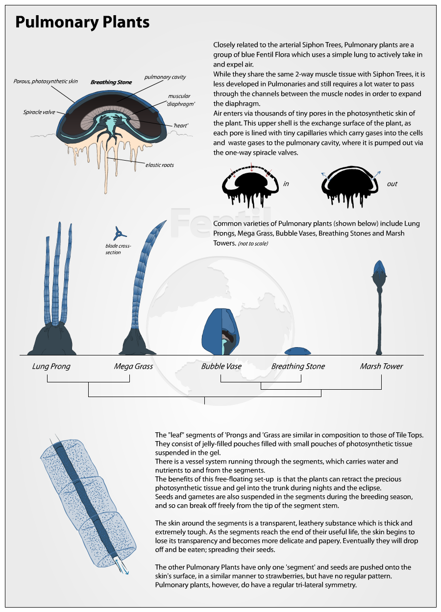
Here's a sheet on a group of Fentil plants, called 'Pulmonaries' because of their lung.
I've missed doing these kinds of sheets, but I forgot how tedious they can be to make, and I am ashamed to say I cut a few corners, but hopefully they're not noticeable.

Also I've been dabbling in graphic design again, and practicing with some iApp-style icons for programs on my computer. There's an interesting piece of software called CandyBar, which is a really good way to change software icons. It has a nice interface, too. I'm tempted to get the full version - I just like to customise things.

I made a re-make of the new iTunes logo. That warpy effect really does do wonders.


And just incase I somehow manage to make it, here's a mock-up of what the Fentil app would look like:

(both in Flash, except for that warpy tunnel effect which I did in 2 minutes in Photoshop - both of which I am also making icons for)
I don't own an iPhone or iPad, so making an app like this would be fundamentally pointless and difficult. With the upcoming OSX Lion, however, similar app to those on iPods and iPads will be available on desktops/laptops.
I honestly can't wait when Apple run out of big cats. Maybe OS XI will be fish or something, though I think insects would be better.

Here's a little doodle I did depicting two parasites from a dream I had a few nights ago (19th of November)

The dream itself was pretty short; I crashed a car in a flooded tunnel and when I got out I was covered in these things.
I can't remember how I got them off, but I ended up in the back of a police car in the middle of a junkyard throwing poisoned/explosive knives at people.
My dreams are weird, but wonderful. It's like watching a strange new film every night. I just wish I could somehow record them, because I tend to forget them very quickly, and even if I write them down the second I wake up, by the time I've written a few bullet-points, most of it becomes a blur.

I recently re-discovered this short film, Trichrome Blue by Lois van Baarle on DeviantArt.

It's a really beautiful piece. The line-less, block colour style and the use of colour is wonderful. The music is good, too.
I really like that multi-screen TV effect. When I first saw this I thought that it must have been near-impossible to do, but now, about a year later, it just looks like a simple AE mask. Done.
It's one of the few animated shorts that really inspire me.
Although she's said she won't be making films for the other colours (yellow and Red), I can't help but wonder what they'd be about.

I also found this a few days ago:

It's a lovely little video. Part of 'It Gets Better' , which is a sort of project help stop intolerance to the gay, bisexual, trans and a whole rainbow of other groups. (No stereotype pun intended. Well maybe just a little...)
Also, all of the people on this video look really easy to caricature.

Sunday, 21 November 2010

11 second update

Nearly there

I've done more since this upload, but it just gives the general idea of whereabouts along this animation I am.


Also, I've had a sudden change of idea for my experimental.
-Swarms-
My plan is to use small pieces of ripped paper, and just make them all fly about eachother, in a similar way to a large flock of starlings, weaving and bending to form amorphous shapes. I want to take it one step further, though and have the swarm form actual objects, which will animate and for a couple of seconds before dissolving back into the noise of the swarm.

I like the idea of perhaps starting with a 'solid' paper object that explodes.

More details once the scans can be uploaded..

Loyal Followers